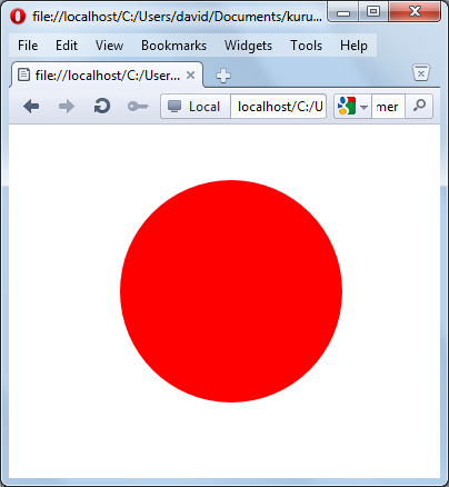
<svg
xmlns="http://www.w3.org/2000/svg">
<circle r="50"/></svg>

|
|
| circle1.svg | |
|
 |
| circle2.svg | |
<line x1="10" y1="10" x2="100"
y2="100">
draws
an invisible line in most browsers, while in ASV+Internet Explorer, a
faint hint of a grey line might be seen (which, curiously, does not
expand in size when we zoom in on it).<line x1="5" y1="5" stroke="red" x2="90"
y2="90" />
|
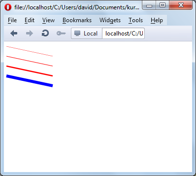 |
| line1.svg | |
|
 |
| line2.svg | |
<svg xmlns="http://www.w3.org/2000/svg"
xmlns:xlink="http://www.w3.org/1999/xlink" ><svg xmlns="http://www.w3.org/2000/svg"
xmlns:xlink="http://www.w3.org/1999/xlink" ><title>Illustration of the use of
SVG image
tag</title><desc>An engraving of a fire
engine taken from the 1911
Webster's Dictionary</desc><image x="15%" width="30%" y="15%"
height="30%"
xlink:href="fireenginefromWebsters1911.gif" /></svg>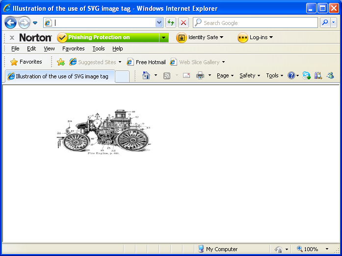
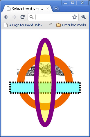
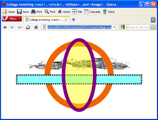
<svg xmlns="http://www.w3.org/2000/svg"
xmlns:xlink="http://www.w3.org/1999/xlink" ><title>Collage involving rect,
circle, ellipse, and image
tags </title></svg><image x="15%" width="70%" y="30%" height="15%"
xlink:href="fireenginefromWebsters1911.gif" />
<image x="15%" width="70%" y="30%" height="15%"
xlink:href="fireenginefromWebsters1911.gif"


preserveAspectRatio="none"/><circle cx="50%" cy="50%" r="25%" /><circle cx="50%" cy="50%" r="25%" fill="none"
stroke="#e60"
stroke-width="25"><rect x="10%" width="80%" y="50%" height="10%"
fill="aqua"
stroke="black" stroke-width="6" /><rect x="10%" width="80%" y="50%" height="10%"
fill="#8ff"
stroke-dasharray="4" stroke="black" stroke-width="6" />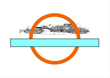
<ellipse cx="50%" cy="50%" rx="10%" ry="40%"
fill="yellow"
stroke="purple" stroke-width="15" />opacity=".5"<ellipse cx="50%" cy="50%" rx="10%" ry="40%"
fill="yellow"
opacity=".45"
stroke="purple" stroke-width="15" />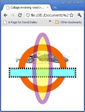
<ellipse cx="50%" cy="50%" rx="10%" ry="40%"
fill="yellow"
fill-opacity=".45"

 stroke="purple" stroke-width="15" />
|
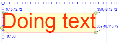 |
| Browser | Left | Top | Bottom | Right |
| IE | 6.15 | 42.72 | 115.79 | 359.48 |
| FF | 8 | 42 | 117 | 358 |
| Opera | -0.14 | 28.47 | 118.53 | 337.37 |
|
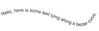 |
| textcurve.svg | |