Gradients in SVG
Gradients are just great! They pretty much always look good, adding a professional feel to your graphics. This owes much to the way the human eye perceives colors as described by scientists like Helmholtzand Newton. The 19th century artist Georges Seurat did a lot to popularize the underlying scientific work showing how scenes may be simulated by collections of points of colored light. Seurat's points are numerous and their size is infinitesimal in the limiting sense. Translated into the world of computer imagery that implies big file sizes. But if we decompose regions not into monochromatic points nor regions (a process known as posterization) but into regions of smooth transition (namely gradients), the artwork may become more realistic as its description becomes more parsimonious. In other words, we can transmit less data and yet present graphics on any size screen that humans perceive as being of higher quality. Excitingly, those descriptions can convey semantics as well as rendering instructions for the browser and it's this that makes SVG amenable to indexing by search engines in a way that can't readily be applied to things like GIF, JPG or PNG. If you're interested in the broader topic of visual perception and information transmission you might like to see some of the work of Marvin Minksy or the articles hereand here for a more modern take.
Let's get started with the basics here. (For further reading,
you can, of course, see the relevant
section of the SVG primer.)
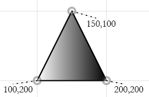
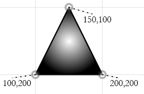
<path d="M 100
200 200 200 150 100 z" |
|
| linear | radial |
|---|---|
|
|
 |
 |
| White is applied from left to right | White is applied from center to outside |
The object to which the gradient will be applied uses a local url (similar to the xlink:href we saw earlier with the <use> object) as the attribute value of the "fill" attribute, hence demonstrating that an object may have a color or a gradient as its fill, but not both.
Note that in the linear gradient above, two "stops" have been built. This means the gradient has two colors applied to it, one for each stop. Those colors are determined by the stop-color attribute. The offset attribute determines where between 0% and 1=100% of the way from left to right, the associated color (in this case black or white) should be applied. That is, white is applied at the leftmost part of the triangle, while black is applied to the rightmost part. Shades of grey gradually darken as we move to the right, with a grayscale value of 128/256 or 50% occurring halfway across the image or along the line where x=150. For the radial gradient, the midpoint of the bounding rectangle around the path is chosen as the center. From there we apply our first stop-color (zero percent of the way out toward the corners of the bounding box). Black will be applied to the four corners of the bounding rectangle, with shades of grey gradually lightening as we move toward the center.
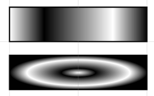
More <stop>s
The number of stops in a gradient need not be limited to two.
The rectangles below are 200 pixels wide. That means the linear
gradient is white at 0 pixels and 150 pixels from the left, and black
at 50 and 200 pixels.
<stop offset="0"
stop-color="white"/> |
 |
Varying angles and centers
Next, we observe that we can change the angle that a linear gradient traverses its fill, or the center point from which the waves of the radial gradient ripple outward.
| The linear gradient in the underlying layer has several stops in black, white and grey. Ordinarily the color-bands would run vertically. We have rotated their angle 30 degrees though with a gradientTransform, rotated about the center (50%,50%) of the <rect>. | 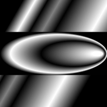 |
The radial gradient in the foreground has had its fx (the x position of its focus) changed to 95% meaning that instead of concentric rings being centered about the middle of the <rect>, they are now offset to its extreme right side. | |
<linearGradient
id="l" |
<radialGradient
id="r" fx=".95"> |
||
Stop-opacity
In addition to specifying the color of a <stop> within a gradient, we may also specify its opacity through an attribute known as stop-opacity. We may thus make gradients act like differential masks, gradually allowing an image underneath to fade in to view.
<stop offset=".8" stop-color="black" stop-opacity="0.5"/>
Stop-opacity (like regular opacity of drawn objects) takes on values between 0 (transparent) and 1.0 (opaque).
Several examples of gradients:
http://srufaculty.sru.edu/david.dailey/W3CCourse/week2/gradients.html