Variations in Timing

In these examples, the timing associated with all attributes has been the same: 5 seconds. Let's consider what happens when we vary that interval for different attributes. In this example, we add a stroke-dasharray to the ellipses and let the center of the second ellipse, as well as the width of the rectangle vary (in synchrony with one another). This demonstrates that de-synchronizing and synchronizing can yield rather fascinating effects! I would posit that we tend to overlay causal explanations of what we see, when in fact, only covaration is present. The scientific study of the perception of illusions is likely to have some great advances in coming years due to the reduced difficulty of creating such demonstrations.

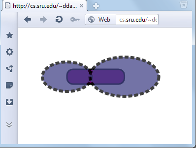
<rect x="100" y="85" rx="12" height="30" width="150" 
fill="purple" stroke="black" stroke-width="3" >
	<animate attributeName="width" dur="3s"  values="150;100;150" repeatCount="indefinite"/>
</rect>

<ellipse id="E" cx="100" cy="100" rx="30" ry="40" fill="#448" opacity=".75"
stroke="black" stroke-width="6" stroke-dasharray="8,4">
    <animate attributeName="rx"  dur="3s" values="10;70;10" repeatCount="indefinite"/>
    <animate attributeName="ry"  dur="5s" values="30;60;30" repeatCount="indefinite"/>
</ellipse>
<ellipse  cx="250" cy="100" rx="30" ry="40" fill="#448" opacity=".75" 
stroke="black" stroke-width="6" stroke-dasharray="8,4">
    <animate attributeName="rx" dur="5s" values="70;10;70" repeatCount="indefinite"/>
    <animate attributeName="ry" dur="3s" values="60;30;60" repeatCount="indefinite"/>
<animate attributeName="cx" dur="3s" values="250;200;250" repeatCount="indefinite"/>
</ellipse>

While the previous example, using stroke-dasharray, appears to present a bit of rotation to the object, this is simply because the circumference of the ellipse is changing (as rx and ry change), and because dash-arrays are allocated in terms of absolute units (pixel widths), the number of dash segments needed to cover the ellipse also varies. We might also experiment with the illusion of rotation in the following way: by animating the dash-offset attribute. (The following example seems only to work in Chrome, Opera, IE/ASV, and FF4 beta, though Safari is rather unhappy with the colors of the gradient.)

<ellipse cx="140" cy="100" rx="50" ry="50" fill="url(#Gold)" stroke="url(#Go)"
stroke-width="18" stroke-dasharray="12,12" >
<animate attributeName="stroke-dashoffset" repeatCount="indefinite"
values="24;1" dur="0.5s" />
</ellipse>

It turns out that there is a better way of rotating objects than by animating the stroke. We'll continue with a dicussion of <animateTransform>