Among the topics covered will be short case studies showing how to make or use the following:
-
simulated cylindrical rotation
-
linear motion that appears nonlinear
-
circular motion with SMIL but without rotation
-
text animated along a curvilinear path
-
animated posterization of a bitmap
-
gradients that are neither linear nor radial
-
clippaths to simulate nonaffine warping
-
animations that traverse nondeterministic bezier patterns
- Introduction
- simulated cylindrical rotation
- linear motion that appears nonlinear
- circular motion with SMIL but without rotation
- nondeterministic landscapes:
- text animated along a curvilinear path
- animated posterization of a bitmap
- natural textures
- recycled animations
- non-rectangular tilings
- gradients that are neither linear nor radial
- clippaths to simulate nonaffine warping
- animations that traverse nondeterministic bezier patterns
- Conclusion
- References
<linearGradient id="V">
    	<stop stop-color="#111" offset="0"/>
    	<stop stop-color="#a41" offset=".1"/>
    	<stop stop-color="#f41" offset=".4"/>
    	<stop stop-color="#a41" offset=".7"/>
    	<stop stop-color="#111" offset="1"/>
</linearGradient>
<rect id="BAR" x="300" y="0" height="100%" width="15%" fill="url(#V)"/>
Figure 1. A static cylinder using a linearGradient\
(Note[2016] see examples at
http://srufaculty.sru.edu/david.dailey/svg/SVGOpen2008/edges_of_plausibility.htm)
Now to convey the impression that such a cylinder is rotating, we might imagine several approaches. It could be done either by moving parts of its ostensible surface around one another, by animating and inserting stops into a gradient or by moving gradient tiles through a clipPath.
<linearGradient id="V">
    	<stop stop-color="#111" offset="0"/>
    	<stop stop-color="#f41" offset=".4">
    		<animate attributeName="offset" dur="2" values="0;.9"  repeatCount="indefinite" />
    		<animate attributeName="stop-color" dur="4" values="red;red;blue;blue" keyTimes="0;2;2;4" fill="freeze" repeatCount="indefinite" />
    	</stop>
	    <stop stop-color="#111" offset="1"/>
</linearGradient>
<rect id="BAR" x="100" y="0" height="100%" width="15%" fill="url(#V)"/>
Figure 2. Sliding stops; swapping colors.
(Note[2016] see examples at
http://srufaculty.sru.edu/david.dailey/svg/SVGOpen2008/edges_of_plausibility.htm)
The above illustrates the basic concept. It is easy to see that this approach appears rather jerky: the visual center of the gradient (the stop) moves uniformly from left to right and then suddenly jumps (despite the color change) to the opposite side again.
We might attempt to adjust the number of stops (to make the transitions smoother) and also to allow the colors to be "passed" from stop to stop, by animating the colors of the stops thusly:
<linearGradient id="V" gradientTransform="rotate(0)">
<stop stop-color="#111" offset="0">
    <animateColor attributeName="stop-color" dur="4"
        values="yellow; #118; #black; red"  repeatCount="indefinite"/>
</stop>
<stop stop-color="#911" offset="0">
    <animate attributeName="offset" id="one" dur="2"
        values="0;.7"  repeatCount="indefinite" />
    <animateColor attributeName="stop-color" dur="4"
        values="#118; #black; red;yellow"   repeatCount="indefinite"/>
</stop>
<stop stop-color="#911" offset="0">
    <animate attributeName="offset" id="two" dur="2"
        values=".7;1"  repeatCount="indefinite" />
     <animateColor attributeName="stop-color" dur="4"
         values=" #black; red; yellow; #118" repeatCount="indefinite"/>
 </stop>
<stop id="FIN" stop-color="#990" offset="1">
    <animateColor attributeName="stop-color" dur="4"
        values="red;yellow; #118; #f8f" repeatCount="indefinite"/>
</stop>
</linearGradient>
<rect id="BAR" x="300" y="0" height="150%" width="15%" fill="url(#V)"/>
Unfortunately, the effect as illustrated here remains unconvincing.
Continuing the approach a bit further with the use of script, the following example, is the best instance of this approach I've been able to create:
Figure 3. Sliding stops; swapping colors.
(Note[2016] see examples at
http://srufaculty.sru.edu/david.dailey/svg/SVGOpen2008/edges_of_plausibility.htm)
The script goes into the DOM and retrieves all the stops within the gradient and swaps them thusly:
Colors=["red","yellow","black", "#118"]
count=0
function rebuild(evt){
	    var N=Colors.length
	    count=(count+1)%N
    	var F=document.getElementById("V")
    	var stops=F.getElementsByTagName("stop")
    	for(i=0;i<stops.length;i++){
        		stops.item(i).setAttribute("stop-color", Colors[(N+count-i)%N])
    	}
    	var P=stops.item(1).firstChild.nextSibling
    	P.setAttribute("begin","indefinite")
    	P.beginElement();
}
The animation in one of the stops serves as a sort of coxswain, both coordinating the passing of colors and the restarting of the other animations.
<linearGradient id="V" gradientTransform="rotate(0)">
    	<stop stop-color="#111" offset="0"/>
    		<stop stop-color="#911" offset="0">
        	<animate attributeName="offset" id="one" dur="2" onend="rebuild(evt)"
	        values="0;.7"  repeatCount="1" />
	    </stop>
		    <stop stop-color="#911" offset="0">
    	<animate attributeName="offset" id="two" dur="2" begin="one.begin"
        	values=".7;1"  repeatCount="1" />
	    </stop>
    	<stop id="FIN" stop-color="#990" offset="1"/>
</linearGradient>
An approach without script would be more elegant, but as yet, I have not pulled it off to my satisfaction.
In 2007 Jeff Schiller posed an interesting question in the svg-developers forum in Yahoo-groups. The question was whether or not one could (without script) animate a series of objects that move first in front of and later behind one another. Following the discussion that ensued, Bruce Rindahl posted a link to some code that accomplished the task. That approach can be used to simulate cylindrical rotation. This listing preserves the essence of that approach by allowing two rectangles to sit atop one another with the top most rectangle becoming invisible during precisely half of its lifespan, hence allowing the middle object to appear in front:
<rect x="205" width="100" height="60%" y="20%" fill="#97f" opacity=".9">
    <animate attributeName="x"  dur="4"
     values="205;300;205"  repeatCount="indefinite" />
</rect>

<rect x="205" width="100" height="60%" y="20%" fill="#ae7" opacity=".8">
    <animate attributeName="x" dur="4" begin="2"
     values="205;300;205" repeatCount="indefinite" />
</rect>

<rect x="205" width="100" height="60%" y="20%" fill="#97f" opacity=".8">
    <animate attributeName="x"  dur="4"
     values="205;300;205"  repeatCount="indefinite" />
    <animate attributeName="visibility" dur="4"
    values="visible;hidden" repeatCount="indefinite" />
</rect>
The concept is that the objects are synchronized so that the top and bottom ones move together but the middle one is one-half cycle behind the others.
Figure 4. A carousel shell-game
(Note[2016] see examples at
http://srufaculty.sru.edu/david.dailey/svg/SVGOpen2008/edges_of_plausibility.htm)
I rather doubt that the XSLT translation from DocBook to XHTML will preserve a working illustration, so if your browser cannot see the SMIL animation above, then you may also look at a working example: here.
The approach that seems to have been most successful consists of drawing, on a rectangle, a gradient for which the left and right sides match. That is, if we were to identify the left and right edges of the rectangle as if folding gently into a cylinder, the resulting gradient would be continuous around the cylinder. Then, all that is required is that we move that rectangle through a viewing window (a clipPath) that is half as wide as the rectangle, taking care to loop the rectangle back to its starting position when it is done. I first devised this approach in about 2001 at this html page using bitmapped graphics where the left and right edges had been mushed together so as to remove the seam when a copy of the image was pasted beside itself. The ideas of wrapping edges of the computer screen is at least as old as the video game Asteroids and the underlying concepts date back to the early days of topology centuries ago.
Here's the basic premise implemented in code:
<linearGradient id="W">
    	<stop stop-color="#aaa" offset="0"/>
    	<stop stop-color="#533" offset=".25"/>
    	<stop stop-color="#aaa" offset=".50"/>
    	<stop stop-color="#533" offset=".75"/>
    	<stop stop-color="#aaa" offset="1"/>
</linearGradient>
<clipPath id="CP">
    	<rect x="45%" y="0" height="100%" width="10%"/>
</clipPath>
<rect y="0" height="100%" width="20%" fill="url(#W)" clip-path="url(#CP)">
    <animate attributeName="x"  dur="2s" values="35%;45%" repeatCount="indefinite" />
</rect>
Notice that the rectangle is exactly twice as wide as the clipPath and that the rect is dragged so that it always covers the clipPath. When it reaches its rightmost extent (45%) it resets promptly back to its leftmost extent (35%). Its rightmost extent coincides with the left edge of the clipPath -- the hole through which we view it.
The above code is illustrated by the example here:
Figure 5. Dragging through a clipPath
(Note[2016] see examples at
http://srufaculty.sru.edu/david.dailey/svg/SVGOpen2008/edges_of_plausibility.htm)
If this example is not visible in your browser (for example it doesn't show up in DocBook apparently because of the clipPath) then take a look here.
Some final improvements are natural.
First we may fill the rectangle with a more interesting texture. For this I chose a barber pole coloration: red, white and blue stripes.
       <g id="base">
           <rect  x="0" y="0" height="40" width="30%" fill="#e12"/>
           <rect  x="0" y="40" height="35" width="30%" fill="#ddd"/>
           <rect  x="0" y="75" height="40" width="30%" fill="#11c"/>
           <rect  x="0" y="115" height="35" width="30%" fill="#ddd"/>
       </g>
Second, instead of using a gradient, we will use a pattern to fill our cylinder, so that rather than sliding a rectangle with texture through a clipPath, we may apply an animateTransform to translate the pattern leftward.
<pattern id="barber" patternUnits="userSpaceOnUse" width="30%" height="150" >
	    <use xlink:href="#bshop" transform="translate(0,-50)">
        <animateTransform attributeName="transform" type="translate"
        dur="2s" from="0 0" to="-150 0" repeatCount="indefinite"/>
    </use>
</pattern>
<rect x="60%" y="0" height="100%" width="10%" fill="url(#barber)"/>
Third, we may skew the gradient so that it appears to wrap around the cylinder helictically. This necessitates replicating the stripes contained in "base" a few times so that the skew does not produce undefined areas in the corners of the rectangle to which it is applied.
<g id="bshop"  transform="skewY(45)">
    <use xlink:href="#base"/>
    <use xlink:href="#base" transform="translate(0,-150)"/>
    <use xlink:href="#base" transform="translate(0,150)"/>
    <use xlink:href="#base" transform="translate(0,-300)"/>
</g>
Fourth, since the resulting figure, is thus far, very flat in appearance, we may overlay a masking region, in this case, a rectangle with bright transparency in the middle and darkness on either edge:
<linearGradient id="gradient1" >
    	<stop offset="0" stop-color="black"/>
    	<stop offset="0.3" stop-color="white" stop-opacity="0"/>
    	<stop offset="0.4" stop-color="white" stop-opacity=".8"/>
    	<stop offset="0.6" stop-color="white" stop-opacity=".0"/>
    	<stop offset="1" stop-color="black"/>
</linearGradient>
<rect x="60%" y="0" width="10%" height="100%" fill="url(#gradient1)"/>
This rectangle has the same dimensions as the rectangle that has been striped with the #barber pattern, and being appended later in the DOM, it lays directly above that striped rectangle.
Finally, we add a bit more texture to the basic tiling of the pattern. This is because if one implements all of the above, the resulting barber-pole (true to the popular illusion the moving barber pole presents) appears to have its strips simply moving downward. Without a bit of additional texture, the drawing is so smooth that the grain of the cylinder cannot be perceived.
<g id="base">
	    <rect  x="0" y="0" height="40" width="30%" fill="#e12"/>
    	<rect  x="0" y="40" height="35" width="30%" fill="#ddd"/>
    	<rect  x="0" y="75" height="40" width="30%" fill="#11c"/>
    	<rect  x="0" y="115" height="35" width="30%" fill="#ddd"/>
    	<circle cx="120" cy="22" r="2" fill="brown"/>
    <circle cx="140" cy="72" r="1" fill="black"/>
    <circle cx="60" cy="122" r="1" fill="brown"/>
    <circle cx="40" cy="252" r="1" fill="yellow"/>
    <ellipse cx="80" cy="32" rx=".5" ry="17" fill="#282"/>
</g>
By adding small "imperfections" (small ovals and circles) to its otherwise smooth surface, the eye will be able to see that we are, in fact, rotating leftward, rather than merely dragging and infinite striped tiling downward.
The resulting effect, as animated by SMIL is, now, rather convincing.
Figure 6. Rotating barber pole
(Note[2016] see examples at
http://srufaculty.sru.edu/david.dailey/svg/SVGOpen2008/edges_of_plausibility.htm)
First, let's look at the movement of a simple unfiltered object whose x and y coordinates are propelled by SMIL (the live code can be seen at this location) :
<rect x="0" y="5" height="90" width="90" fill="none" stroke="#888" stroke-width="8"/>
<rect id="r" height="50" width="50" fill="url(#V)"/>
<circle r="5" fill="#39d" >
    <animate attributeName="cy" dur="6.5s" values="90; 10; 90"
     repeatCount="indefinite"/>
    <animate attributeName="cx" dur="4.7s" values="0; 90; 0"
     repeatCount="indefinite"/>
</circle>
So long as the periodicities of cx and cy (in this case and ) are not multiples of one another (or of a large common divisor) then the movement of the object will resemble the bouncing of a billiard ball. This sort of piecewise linear motion is typical of this sort of animation. We could with relative ease, append circular and linear components to the motion by having one of these linear animations turn itself off at the end of an iteration and then, in turn activate an animateTransform which would rotate the object circularly for a certain duration, but the class of scriptless motions afforded is still rather constrained. In the next section, we'll look at how time signatures can change the nature of the motion further, but in the meantime consider how an object might be deformed through an feDisplacement filter as it moves over a gradient:
<defs id="DEF">
<linearGradient id="V" gradientTransform="rotate(25)" >
    	<stop stop-color="#000" offset=".3"/>
    	<stop stop-color="#a60" offset=".5" />
    	<stop stop-color="#000" offset=".96"/>
</linearGradient>
<filter id="D" filterUnits="userSpaceOnUse" x="-25%" width="150%" >
    	<feImage xlink:href="#r" result="M" />
	    <feDisplacementMap in="SourceGraphic" in2="M" scale="27"
	    xChannelSelector="R" yChannelSelector="G"/>
</filter>
</defs>
<rect x="0" y="5" height="90" width="90" fill="none" stroke="#888" stroke-width="8"/>
<rect id="r" x="0" y="5" height="90" width="90" fill="url(#V)"/>
<g id="F" transform="translate(13,13)" fill="yellowgreen" >
<circle r="4" id="B" fill="inherit"  >
    <animate attributeName="cy" dur="8.5s" values="80; -5; 80"
     repeatCount="indefinite"/>
     <animate attributeName="cx" dur="10.7s" values="-10; 75; -10"
     repeatCount="indefinite"/>
</circle>
</g>
<use xlink:href="#B" opacity=".75" filter='url(#D)' fill="purple"/>
In this example (which can be seen live at this location), two circles are animated in the same way. One is yellow-green, the other purple. The purple one, though, has its path "disrupted" by an feDisplacementMap: as it slides over a ramp that goes from black to orange to black again, its x and y positions are displaced according to the magnitude of the redness and greenness underneath. One may observe from the example that the balls remain in synchrony and appear in about the same location when they are atop black content, but that their locations diverge most when the purple ball is over the brightest part of the orange ramp.
The possibilities for non-scripted but highly nonlinear motion based on such examples are clearly numerous, as one considers groupings, rotations, reuses, and patterns associated with various types of complex and composite gradients. We close this section with one more example (visible here, if the embedded version should not be visible) that take the above code but merely adds an animateTransform to rotate the angle of the gradient. Clearly, by using both SMIL and filters, one will need either Opera 9.5, IE/ASV, Batik, or possibly Renesis to view. It has been confirmed to work in the first two of these environments.
Figure 7. Rotating gradient to deflect bouncing balls
(Note[2016] see examples at
http://srufaculty.sru.edu/david.dailey/svg/SVGOpen2008/edges_of_plausibility.htm)
<ellipse cx="180" cy="175" rx="30" ry="30" fill="blue">
<animateTransform attributeName="transform" type="rotate" dur="2" from="360,280,200" to="0,280,200" repeatCount="indefinite"/>
</ellipse>
We might have it traverse a circular path (as defined by an arc) thusly:
<path d="M200 100 A 150,150 0 1,0 201,99 z " id="C"
	opacity="0.5" fill="#080" stroke="#8f8" stroke-width="5" />

<circle cx="7" cy="-5" r="20" fill="#8888ff" stroke="#44aa88">
    	<animateMotion dur="2s" rotate="auto" fill="freeze" repeatCount="indefinite" >
        		<mpath xlink:href="#C"/>
    	</animateMotion>
</ellipse>
<circle cx="50%" cy="20" r="5%" fill="blue">
	<animate attributeName="cx" dur="3" values="5%; 95%;5%"
 repeatCount="indefinite" />
	<animate attributeName="cy" dur="6s" values="5%; 95%;5%" keyTimes="0;0.5; 1"
	 calcMode="spline" keySplines="1 0 0 1; 0 0 1 1"  repeatCount="indefinite" />
</circle>
The resulting behavior, over time, looks as follows:
Figure 8. Some key times, using keySplines
(Note[2016] see examples at
http://srufaculty.sru.edu/david.dailey/svg/SVGOpen2008/edges_of_plausibility.htm)
Here, the path followed during the first half of the animation is the path on which points 1,2,3,4,5, and 6 lie. After the midpoint of the animation, the blue circle returns to its initial position via the line 6, 7, 8, 9, 10. If calcMode=â€spline†were not invoked, the animation would follow the path (10,9,8,7,6,7,8,9,10) repeatedly. The keySplines attribute contains a series of two control points in the (timein, timeout) plane, or four integers for every inter-keyTimes interval: in other words, we will have 4(n-1) integers for n keyTimes. Each pair of control points defines an approach gradient between the associated pair of key values. In this example, we will begin at (t=0, y=5%) and follow the spline attracted first by (t=1, y=5%) (all the while x is increasing linearly); then attracted by (t=0, y=95%) and finally ending up (at the end of the first transition) at (t=1, y=95%) namely halfway through the animation at position #6. (since x with half the duration has already been reset to its endpoint, 5%). The animation will speed up considerably between positions #3 and #4 since that is when the time deformation is greatest. The animation continues back along the two lines, since the keySplines path “0 0 1 1†does not alter the time sequence in the second half of the animation.
The second example contrasts conventional animation (the green ball is unwarped over time) with time-warped animation (the blue one has both its "cx" and "cy" attributes warped in the "cy" attribute is warped in the above example. In it the green ball traverses the black diamond, while the blue one follows the circular arc. We note the apparent change in speed for the blue ball -- I currently know of no way to normalize this.
Figure 9. keySplines1.svg
(Note[2016] see examples at
http://srufaculty.sru.edu/david.dailey/svg/SVGOpen2008/edges_of_plausibility.htm)
In the inexpensive animation of television in the 1960's one can probably recall how the heroes might be chased by the villains across a backdrop that was used to give the illusion of motion. If one watched carefully, we could notice that the backdrop repeated itself every few seconds. The animation of the backdrop was run cyclically, presumably to save on the cost of human animators' time. We may accomplish something better with script. The example I will discuss is rather script intensive and I could not get my word-processor (Oxygen/DocBook) to insert the working example here, but it may be seen on the web at this location. The basic premise begins with a path that has been filled with a gradient:
<linearGradient id="foot" x1="0%" y1="0%" x2="0%" y2="100%">
    	<stop offset="0" stop-color="#b87"/>
    	<stop offset=".1" stop-color="#b63"/>
    	<stop offset=".70" stop-color="#c86"/>
    	<stop offset=".90"  stop-color="#bc7"/>
</linearGradient>

<path id="foothills" d="M 0 500 400 400 800 500 z" fill="url(#foot)" stroke="none"/>
We will seek to redefine that path into a more complex sequence of Bezier segments that are randomly created, and changed on-the-fly so as to simulate the movement of background scenery. To do this involves a small trick: let us generate a series of (x,y) pairs as JavaScript objects. Suppose we would like those objects to become the contour of a mountainous horizon, then we wish the points to be ordered from left to right so that the resulting edge that will connect their top appears as a function y=f(x) which is everywhere defined over the domain x. We would clearly like our points to be connected by curves that are not just line segments (bezier segments seem quite more appealing) and we also do not want the intervals along the x-axis to all be uniform. What we may do then, is to generate a series of points uniformly over a rectangle, and then to sort those points (as rows in a spreadsheet) according to their x axis. This will select randomly from all discrete-valued functions defined over that domain x range rectangle. That the sort function can be done in n log n time signature, means that the operation will be fast.
function draw(peaks,hi,up){
    	Hills=document.getElementById("foothills")
    	Hi=hi //the height of the mountains from the ground
    	UP=up //the elevation of the ground
    	var points=3*peaks
    	for (i=0;i<points;i++){
        		Peaks[i]= {
            			x: Math.floor(Math.random()*rightedge),
            			y: Math.floor(Math.random()*hi)+up
        		}
    	}
    	Peaks.sort(compare)
    	s=render(Peaks,0)
    	Hills.setAttribute("d",s)
}
function compare(x,y){
    	if (x.x<y.x) return -1
	    else return 1
}
The customizable sort function of JavaScript is apparently borrowed from Java, though one can certainly see hints of it in the unix shell sort utility from a few decades before. The first time I saw it I was left agog by its extensibility. The above code creates an array of x-y point objects placed in order along the x axis. It now remains simply to render these points as a series of bezier curves. The "render" function, shown below, actually builds the string that defines the "d" attribute of the path used as the outline of the foothills. It merely interleaves a series of control and end points of cubic splines, stitching the ends together when done.
function render(Arr,lo){
    	var low=Math.floor(bottomedge*.9)
    	var s="M "+0+" "+(low)+" C"
    	s+=7+" "+(low - Arr[0].y)+" "
    	for (i=1;i<Arr.length;i++){
        		s+=Arr[i].x+" "+(low - Arr[i].y)+" "
    	}
    	s+="L "+(rightedge)+" "+low+" Q "+(rightedge/2)+" "+(low)+" "+40+" "+(low)+" z"
    	return s
}
Having thus created an array of x-y points that is ordered on the x-axis, we may animate the drawing by pushing a new random point onto the end of the array, shifting one off from the beginning of the array and then moving all the points in between, by some speed factor, a little to the left.
function animate(){
    	onestep()
    	window.setTimeout("animate()",10)
}
function onestep(){
    	var speed=1
    	for (j=0;j<Peaks.length;j++){
        		Peaks[j].x-=speed
    	}
    	if(Peaks[3].x<0){
		        st=rightedge
        		for (k=0;k<3;k++){
            			newx=st+Math.ceil(80*Math.random()/Peaks.length)
            			var Q={x: newx, y: Math.floor(Math.random()*Hi+UP)}
            			st=newx
            			Peaks.push(Q);
            			R=Peaks.shift()
        		}
    	}
    	s=render(Peaks,R.y)
    	Hills.setAttribute("d",s)
}
In the version visible on the web, several different layers of mountain can be likewise constructed, with taller mountains behind and foothills in front. The objects in the foreground can then be made to move by faster, simulating several layers of separate animation.
Animating the start-offset of text laid out along a path results in an appealing textual effect. We begin with three observations: first text may be laid out along a curve (see Text on a Path); second, the horizontal offset along that curve may be specified by an attribute (startOffset). Finally, that attribute (like most in SVG) is animateable:
<path id="curve1" d="M 10 100 C 200 30 300 250 350 50"
stroke="black" fill="none" stroke-width="5" />
<text id="T" style="font-family:ariel;font-size:16">
    <textPath xlink:href="#curve1" startOffset ="10">
        <animate attributeName="startOffset" dur="7s" from="0" to="390"
            repeatCount="indefinite" />
        Hello, here is some text crawling along a bezier curve.
    </textPath>
</text>
Figure 10. Illustration of text moving on a path
(Note[2016] see examples at
http://srufaculty.sru.edu/david.dailey/svg/SVGOpen2008/edges_of_plausibility.htm)
In the illustration of Figure 10, we can see (if the browser supports SMIL) that the text moves all the way across the path before resetting itself. If we duplicate the text, making two copies of the string itself, and then attempt to animate it so that it flows continually, the effect can be achieved by letting the startOffset loop from -370 to about 20 in Internet Explorer/ASV. However, the specification does not allow negative values for startOffset, so I am not sure if the effect seen here (working in IE/ASV but not in Opera) can be accomplished or not.
<filter id="discrete">
	    <feComponentTransfer>
        		<feFuncR type="discrete">
            			<animate attributeName="tableValues" values="0 0 1;0 1 1; 0 0 1" dur="3s" repeatCount="indefinite"/>
        		</feFuncR>
		        <feFuncG type="discrete" tableValues="0 1"/>
        		<feFuncB type="discrete" tableValues="0"/>
    	</feComponentTransfer>
</filter>
<image id="M3" x="250" xlink:href="p17.jpg" filter="url(#discrete)" width="250" height="250" />
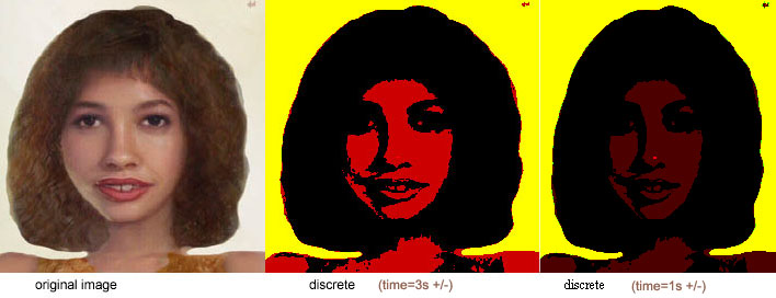
In this example (code above, live here, and illustrated below), we show a mapping of values in the R, G, and B channels of a single image. This filter maps the red values in the interval [0,1] to one of the three values as follows: (0 to .33) --> 0; (.67 to 1.0) --> 1; and (.33 to .67) --> x, where the value of x is chosen by the animation to oscillate between 0 and 1. In this way we may see the effect of changing the discretization function over time. The green channel is mapped to either 0% or 100% green with the threshold between these levels being chosen halfway between the endpoints. The blue channel (relatively insignificant in this particular image) is dampened to black (removing its effect altogether). The source image has no alpha channel (i.e., it is everywhere opaque), hence there is no need to modify that channel.
One of the ostensible reasons for posterizing a bitmapped image is for the sake of compression: creating an image with fewer bits per pixel. Another is as an intermediate stage in converting a bitmap to a series of vectors. This last process, involving edge tracing or some similar method for recognizing the boundaries between areas of similar pixel values is an area of considerable interest in the research. Open source tools such as Inkscape and NIH Image both provide some forms of bitmap to vector conversion, as does the proprietary tool Adobe Streamline. Doing this with SVG in the browser is a bit of an academic exercise, since SVG 1.1 gives us no way of knowing where, in an image, certain edges might be, or of knowing what the color value is at a given pixel value. I gather though that the SVG working group has considered ways of doing that, and if it is possible to load SVG images into the HTML <canvas> tag, then we might be able to interrogate pixel values from there. At any rate suppose we were interested in taking the image above as discretized (3 values on the red channel, 2 on green and 1 on blue), and drawing a smooth contour around the monochromatic regions. The fact that pixellation occurs (in this image around the eyes and mouth) complicates the matter of drawing a smooth curve around monochromatic regions. This might be addressed by applying either an averaging function (like the mosaic filter in Adobe Photoshop (TM)), or a Gaussian blur. The latter would seem to hold more promise for this particular purpose (and it exists within SVG).
At this web site, we may see an example of first providing a Gaussian blur (the standard deviation is animated from 1 to 8 pixels in radius) followed by a feComponentTransfer involving discrete remappings of the color channels. The animations of the red and green channel as well as that of the blur are kept out of synchrony with one another so we can get some sense of the range of topographies induced by this combination of filters. Relevant code is illustrated along with a few representative screen shots:
<filter id="discrete">
    	<feGaussianBlur stdDeviation="5">
        		<animate attributeName="stdDeviation" values="1;8;1" dur="5s" repeatCount="indefinite"/>
    	</feGaussianBlur>
    	<feComponentTransfer>
        		<feFuncR type="discrete" tableValues="0 .25 .75 1">
            			<animate attributeName="tableValues" values="0 .1 .2  .7 .9 1 1 ;0 .1  1 .7 .9 1 1 ;0 .1 .2  .7 .9 1 1 " dur="3s" repeatCount="indefinite"/>
        		</feFuncR>
		        <feFuncG type="discrete" tableValues="0 1">
            		<animate attributeName="tableValues" values="0 .5 1;.2 .8 0 ;0 .5 1 " dur="4.7s" repeatCount="indefinite"/>
        	</feFuncG>
		        <feFuncB type="discrete" tableValues="0"/>
	    </feComponentTransfer>
</filter>
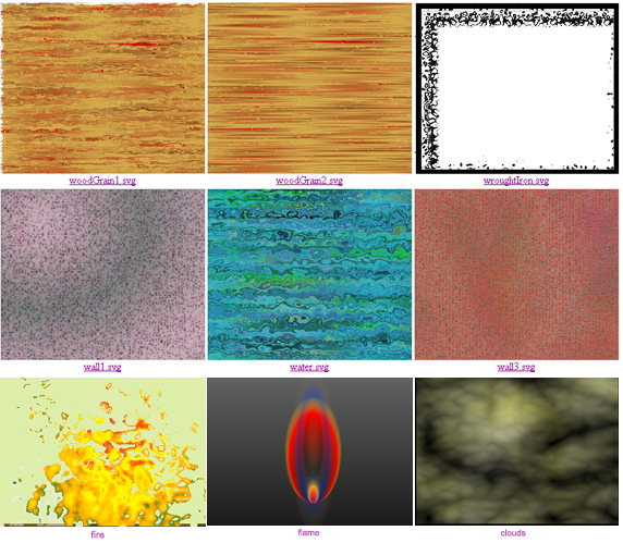
To make some clouds, I'll first begin with a rectangle filled with turbulence:
<filter id="twoF">
    	<feTurbulence baseFrequency=".01" numOctaves="4" seed="200"/>
</filter>
<rect x="25%" y="25%" filter="url(#twoF)" height="50%" width="50%"/>
Next, we add some animation to both the scale of the turbulence (to convey a sense of motion to the clouds) and the seed (the numeric seed that determines which part of the turbulence function is actually accessed). By varying the seed, we generate a class of similar maps, but ensure that the actual shape of the clouds will vary over time.
<filter id="twoF">
	    <feTurbulence baseFrequency=".02" numOctaves="4" seed="200">
        	<animate attributeName="baseFrequency"  dur="3s" end="R.mousedown" fill="freeze"
         values=".001 .003;.002 .002;.001 .003" repeatCount="indefinite"/>
		        <animate attributeName="seed"  dur="30s"
        		values="300;310" repeatCount="indefinite"/>
    	</feTurbulence>
</filter>
<rect id="R" x="25%" y="25%" filter="url(#twoF)" height="45%" width="45%"/>
While the above effects do not change the nature of the static appearance of the rectangle, they certainly vary it as seen in the browser. Next, since the colors are still too polychromatic for clouds, we might dampen the color by selectively altering the three channels with an feComponentTransfer that moves both red and green toward white, but allows the blue channel to oscillate, hence conveying a golden tinge to the clouds.
<feComponentTransfer>
        <feFuncR type="discrete" tableValues="1"/>
        <feFuncG type="discrete" tableValues="1"/>
       	<feFuncB type="linear" slope="1" intercept="0">
			<animate attributeName="slope" values="-1;1;-1" dur="3s" repeatCount="indefinite"/>
			<animate attributeName="intercept" values="1;0;1" dur="2s" repeatCount="indefinite"/>
		</feFuncB>
	</feComponentTransfer>
The overall effect as animated can be seen on the web here.
We turn now to a very different effect, the example of the fire created by distorting a radial gradient through displacement by turbulence. Let us begin with a rough fire-like shape and fill it with a rough fire-like gradient. We need not be too careful with either, since the filter effects will tend to make the original barely recognizable anyway. But starting with a hint of a proper drawing, will serve to give an impressionist suggestion of what we had in mind.
<defs>
<radialGradient id="gradient1" cy="70%" fy="100%" r="70%">
	    <animate attributeName="cx" dur="1.5s"
       		values="20%; 75%; 20%" repeatCount="indefinite"/>
    	<stop  offset="0" stop-color="#8cf"/>
    	<stop  offset="0.14" stop-color="#f40"/>
    	<stop  offset="0.7" stop-color="yellow"/>
    	<stop  offset="0.8" stop-color="orange"/>
    	<stop  offset="0.96" stop-color="#482"/>
    	<stop  offset="1" stop-color="#eee" stop-opacity=".5"/>
</radialGradient>
</defs>
<rect id="Q" x="0" y="0" width="100%" height="100%" fill="#213"/>
<path id="P" transform=" scale(1,1.3) translate(5,25)" fill="url(#gradient1)"
d = "M 100 50 140 70 120 80 100 50 M 121 173 165 67 176 113 195 92 230 123 254 79 268 39 273 91 286 51 323 166 336 125 337 77 365 138 363 212 104 212 101 122 z"
/>
For the effect of simulating how the hottest point of a fire tends to move rather suddenly from place to place, as complex reactions of wind, fuel, and heat interact we allow the center of the radial gradient (cx) to oscillate from left to right rather swiftly.
Now, is the time to perform the magic. We apply a filter which consists of a displacement map that overlays the path and its gradient over a turbulence filter, with the displacement offsetting the x and y locations of our drawing based on the chromatic values of the (seemingly random) turbulence.
<filter id="turbF" x="0%" width="150%" y="0%" height="200%">
	    <feTurbulence baseFrequency=".04" numOctaves="1" result="turb" />
	    <feDisplacementMap scale="100" in="SourceGraphic" in2="turb" xChannelSelector="R" yChannelSelector="B" />
</filter>
Finally, we animate various aspects of the turbulence and the distortion. Here we choose the baseFrequency of the turbulence, which controls its "crinkliness," and the scale of the displacement which determines how far pixels will be moved.
<filter id="turbF" x="0%" width="150%" y="0%" height="200%">
    	<feTurbulence baseFrequency=".04" numOctaves="1" result="turb">
        		<animate attributeName="baseFrequency" dur="5s"
            		values=".03; .02; .01; .04; .03" repeatCount="indefinite"/>
    	</feTurbulence>
    	<feDisplacementMap in="SourceGraphic" in2="turb" xChannelSelector="R" yChannelSelector="B">
		        <animate attributeName="scale" dur="1.9s"
        		values="100; 200; 100" repeatCount="indefinite"/>
    	</feDisplacementMap>
</filter>
The resulting effect shown here has a cartoonish quality reminiscent of Maleficent in Disney's Sleeping Beauty. That effect can be made less cartoonish by increasing the number of octaves to the turbulence, but at considerable cost to the speed of the animation.
The above may be seen at this location, and a considerably more outrageous version (which uses spreadMethod="reflect" on the gradient) can be see here.
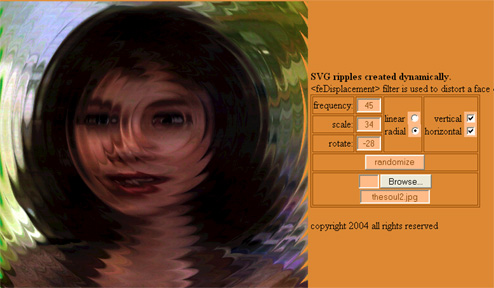
One may also produce a variety of aquatic themes (perhaps as antidote to all the fire?) using combinations of animated gradients, feDisplacementMap, feFlood, feColorMatrix and feTurbulence. The reader is referred to this collection for further study, but one of my older examples deserves special mention. In the example located at http://srufaculty.sru.edu/david.dailey/svg/waves.html, a distortion filter is applied to a bitmap. The distortion gets its magnitude data from a series of concentric waves (radial gradients) that ripple outward from the center. In order to accomplish this, script was involved to allow gradient stops to propel themselves outward, with outermost gradients being removed and relocated at the center of the gradient. As it runs in IE/ASV, the user may choose a custom image from her own hard drive, since IE has not yet decided that users should not be able to access their own file space with a file upload for local consumption. (For whatever reason, the WHATWG seems to have declared that to be intrinsically naughty, and the HTMLWG seems content to follow along.) The example is also noteworthy for its use of HTML widgets like selects, checkboxes and radios to allow for user control and modification of the animation.
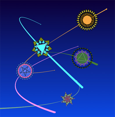
For this example, the premise is somewhat simplified for sake of illustration. We have a collection of randomly generated caterpillars (each with its own DNA, coloration, and behavior) and then suddenly, during that awkward phase known as metamorphosis, they become butterflies (for example). The DNA remains consistent, and the expression of those chromosomes, through coloration and behavior, bears some resemblance to the original. But overall, most observers (at least from the human species) will perceive that a major transformation has occurred. Let's build a simplified version of this scenario. We begin with a "prototype group" containing three proto-stars (paths) and animations to reposition and resize the group:
<g id="Proto">
    <animateMotion  begin="indefinite" dur="2s" rotate="auto" fill="freeze"
	        repeatCount="1" path="M 0 100 600 400" onend="rebirth(evt)"/>
    <animateTransform  attributeName="transform" type="scale" dur="4s"
        begin="indefinite"  values=".25;1" repeatCount="1"/>
<path  stroke-width="1.5" fill-rule="evenodd" />
<path  stroke-width="1.5" fill-rule="evenodd" />
<path  stroke-width="1.5" fill-rule="evenodd" />
</g>
Let us suppose that we have a program which, in response to a mouse click, clones the above prototype and builds a series, called a "composite star," of three n-pointed stars, each having a randomly chosen number of points, n, with gradually diminishing radii, from back to front. Further let us suppose that the stroke and fill colors associated with each of the stars is randomized, and that the composite star is created and centered at the locus of the mouseclick. Assume, furthermore, that an animation, customized for each composite star, is developed so that the composite star moves with a randomly generated speed along a randomly constructed curve leading from its start position to some final random ending position. By the time all this has been accomplished, this composite star has had a goodly amount of "personality" built for it. The illustration below displays several incarnations of one composite star which might preserve its coloration patterns, its path of motion, rate of speed, nature of rotation, and so forth. All that changes from one incarnation to the next is the shape of the individual stars from which it is composed.
The particular script which might create such stars and such random paths need not concern us here though the reader may view this example at http://srufaculty.sru.edu/david.dailey/svg/svgopen2008/makestars3.svg . In the example, the animation progresses deterministically: a composite star reaches the end of its path and then restarts. The key point here is that the stars have been defined with quite a bit of structure. The following illustration gives an idea of how different coloring patterns and pathways (representing a "species" ) might actually exemplify more intra-individual similarity than might be masked by the vagaries of metamorphosis.
function rebirth(evt){
	    var G=evt.target.parentNode
    	var Os=G.getElementsByTagName("path")
    	var r=Math.random()*60+25
    	for (var i=0;i<3;i++){
        		var s=makeStar(r-(i*15))
        		Os.item(i).setAttribute("d", s)
    	}
    	evt.target.nextSibling.beginElement()
    	evt.target.beginElement()
}
We find the three paths associated with the group, and simply modify their "d" attributes and their radii (r). The object is modified, but neither the object itself, nor the animation within, is removed from the DOM. We need, then, merely to restart any animations associated with the group, including the evt.target itself, using the beginElement() command from JavaScript. The fully functional code may be seen at http://srufaculty.sru.edu/david.dailey/svg/svgopen2008/makestars4.svg, while another allied example which moves composite stars through a clipPaths leading parallel to animateMotion paths can be seen here.
The pattern tag in SVG allows the rectangular tessellation (or tiling) of the plane with whatever material we place inside a rectangle. How might we tessellate more freely? A few remarks should first be made about tiling. First there are the familiar three tilings offered by the regular n-gons: equilateral triangles, squares, and regular hexagons. Beyond these, there are a large variety (containing numerous open problems) of tilings that involve other shapes (or collections of shapes). Often tessellations are divided into the categories periodic, nonperiodic, and aperiodic. The periodic tilings include the 3 tilings by the regular n-gons, but they also involve tilings of more than one shape such as a tiling involving squares of unit length and equilateral triangles. Paul Bourke's treatment provides further insights into this rich area, as does the Wikipedia article. Nonperiodic tilings (also called non-deterministic tilings since the locus of individual tiles is not determined, a priori) are numerous in kind with familiar examples including the use of the 60 degree rhombus, the half-hexagon (a regular hexagon cut into two trapezoids and sometimes used in deck and patio tilings), and a variant of the snub square tiling, in which the restriction that squares never abut one another is relaxed. The aperiodic tilings (of which the tilings of Penrose are most familiar) are those in which periodicity may never occur (unlike the nonperiodic tilings where periodicity is certainly one of the possibilities).
For the periodic tilings, the fact that the tiling repeats (via simple translation) means that we may use SVG's <pattern> tag to embed each such tiling in the plane.
|
|
|
The code used for such tiling is quite straightforward, though a bit tedious to render in SVG since each of the polygons must be replicated sufficiently often that the entire pattern rectangle is covered so that the left side wraps to the right and the top to the bottom, toroidally. In the case of the combination of rectangles and triangles, at left, the pattern space is filled with no fewer than 17 separate path statements:
<pattern id="Pattern" patternUnits="userSpaceOnUse"  width="109" height="109" >
	    <path d="M 0 0 L 200 0 100 173.2 z" fill="url(#sand)"/>
    	<path d="M 200 0 L 100 173.2 273.2 273.2 373.2 100  z" fill="url(#backsky)"/>
    	<path d="M 0 0 L 100 173.2 -73.2 273.2 -173.2 100  z" fill="url(#backsky)"/>
    	<path d="M 100 173.2 L 273.2 273.2 100 373.2  z" fill="url(#mountain)"/>
    	<path d="M 100 173.2 L -73.2 273.2 100 373.2  z" fill="url(#sand)"/>
    	<path d="M 200 0 L 100 173.2 273.2 273.2 373.2 100  z" fill="url(#backsky)" transform="translate(-273.2,273.2)"/>
    	<path d="M 273.2 273.2 L 373.2 446.4 200 546.4  100 373.2  z" fill="url(#backsky)"/>
    	<path d="M 200 546.4 L 100 373.2 0 546.4 z" fill="url(#mountain)"/>
    	<path d="M 273.2 273.2 473.2 273.2 373.2 100 z " fill="url(#mountain)"/>
    	<path d="M 273.2 273.2 473.2 273.2 373.2 446.4 z " fill="url(#sand)"/>
    	<path d="M 200 0 L 100 173.2 273.2 273.2 373.2 100  z" fill="url(#backsky)" transform="translate(273.2,273.2)"/>
    	<path d="M 0 0 L 100 173.2 -73.2 273.2 -173.2 100  z" fill="url(#backsky)" transform="translate(546.4,0)"/>
    	<path d="M 100 173.2 L -73.2 273.2 100 373.2  z" fill="url(#sand)" transform="translate(546.4,0)"/>
    	<path d="M 100 173.2 L 273.2 273.2 100 373.2  z" fill="url(#mountain)" transform="translate(273.2,-273.2)"/>
	    <path d="M 100 173.2 L -73.2 273.2 100 373.2  z" fill="url(#sand)" transform="translate(273.2,-273.2)"/>
	    <path d="M 100 173.2 L 273.2 273.2 100 373.2  z" fill="url(#mountain)" transform="translate(273.2,273.2)"/>
	    <path d="M 100 173.2 L -73.2 273.2 100 373.2  z" fill="url(#sand)" transform="translate(273.2,273.2)"/>
</pattern>
The pentagonal tiling at right uses a bit of sleight of hand: I simply used a bitmap that I had drawn many years ago:
<defs>
<pattern id="TilePattern" patternUnits="userSpaceOnUse" width="62" height="36" >
<image id="tile" xlink:href="smalltile3.png" height="36" width="62"/>
</pattern>
<clipPath id="CP"><use xlink:href="#Q" /></clipPath>
</defs>
<text x="75" y="25" font-size="15" fill="black" > -- The pattern space</text>
<text x="10" y="100" font-size="15" fill="black" > used in <pattern> -- </text>
<ellipse fill="url(#TilePattern)" cx="40%" cy="35%" rx="30%" ry="20%" stroke="black" stroke-width="1"/>
<rect id="Q" x="0" y="0" width="62" height="36" fill="none" stroke="black" strokewidth="4" />
<g clip-path="url(#CP)">
<use xlink:href="#tile" />
</g>
The use of <pattern> to thusly create interesting effects of non-rectangular tilings may be seen in the following examples:
| Triangular tiling with animated gradients: Sunrise in Tokyo | http://srufaculty.sru.edu/david.dailey/svg/triangles6.svg |
| Triangular tiling with animated gradients: Kissing triangles | http://srufaculty.sru.edu/david.dailey/svg/triangles7.svg |
| Rotating squares and triangles: Recombinant Scrambled Egg | http://srufaculty.sru.edu/david.dailey/svg/svgopen2008/patternTile3.svg |
In certain cases, we may wish to tile nonperiodically or to fill each of several tiles with different content. In either of these cases, <pattern> will prove insufficient, and we will need to rely on script instead. By laying out each of a collection of tiles individually, each may be uniquely positioned, and each may be individually filled, stroked, and animated. The code for tiling in this way need not be overly complex. In the example at here, in which each triangular tile is given its own pulsating gradient, begins by placing two equilateral triangles in a group:
<g id="gg" transform="scale(0.5)">
    <path id="P" d="M -100 173.2 L 100 173.2 L 0 0 z" fill="url(#g)"/>
    <path id="P2" d="M 0 0 L 100 173.2 L 200 0 z"  fill="url(#g2)" />
</g>
We then locate the group by id, and proceed to clone it, stamp both of its triangles with a unique id, verify that we have not yet run out of room on the screen and add a transform to lay the content out from side-to-side and row-by-row.
id++
	if (ys*id>bottomedge/scale) {off++; id=0}
var 	clone=gg.cloneNode("true")
	newg("X"+id) //this customizes the gradient of the first triangle
	newg("Y"+id) //this customizes the gradient of the second triangle
	var x=(off - (id%2)/2)*xs
	var y=Math.floor(ys*id)
	clone.setAttributeNS(null,"transform","scale("+scale+") translate("+x+" "+y+")")
Laying out hexagonal tilings is very similar. Examples of square, triangular, and hexagonal tilings laid out by script so as to enable individualized treatments of the individual tiles can be seen in these examples.
The script which generates this is quite simple and can be seen (with a bit of animated flair) at this location. The key aspect that has served to keep the script simple, is that the prototype is are cloned and rotated, meaning that the applicable gradient receives the new rotation as well:
function startup(evt) {
    	Root = document.documentElement;
    	P = document.getElementById("P");
    	ys=300;
    	angle=40
    	P1={x:0,y:0}
    	P2={x:xwide*(ys+angle),y:-ys}
    	P3={x:-xwide*(ys+angle),y:-ys}
    	P.setAttribute("d","M "+P1.x+" "+P1.y+" "+P2.x+" "+P2.y+" "+P3.x+" "+P3.y+" z")
    	for (var c=0;c<(360/angle);c++) newAngle(angle*c)
}
function newAngle(a){
	    var clone=P.cloneNode("true")
	    clone.setAttributeNS(null,"transform","translate(300 250) rotate("+a+" 0 0) scale("+.5+") ")
	    Root.appendChild(clone);
}
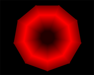
Clearly if the angle is reduced so that more than 9 triangles are used, the approximation to a radial gradient becomes that much better. If, however, the overall direction of the change in the gradient is not to be uniformly rotated as above, then this simplicity disappears and we must independently customize new gradients for each triangle as illustrated below and instantiated at this location.
The above svg illustration renders similarly in oXygen and IE/ASV, though Opera 9.5 appears not yet to support free graphics in a font definition. The rather simple source code can be seen below, and a live web version (with animation on the gradient) can be seen here.
<svg xmlns="http://www.w3.org/2000/svg"
    xmlns:xlink="http://www.w3.org/1999/xlink"
    viewBox="180 20 200 190">
<defs>
    	<linearGradient id="g" gradientTransform="rotate(90 .5 .5)">
        		<stop offset="0" stop-color="#880"/>
        		<stop offset=".4" stop-color="#000" />
        		<stop offset=".9" stop-color="#ff8"/>
        		<stop offset="1"  stop-color="#880"/>
	    </linearGradient>
	<font horiz-adv-x="100">
		    <font-face font-family="GradientP"  units-per-em="100"/>
		    <glyph unicode="p" >
			        <path d="M 20 280 L 230 280 230 -160 20 -160z"  fill="url(#g)" />
    		</glyph>
	</font>
</defs>
	<path id="P1" fill="none" stroke="none" stroke-width="2" d="M 100 110 C 300 310 300 -90 500 110"/>
<text font-family="GradientP" font-size="10" >
    <textPath xlink:href="#P1" method="stretch"> ppppppppppppppppppppppppppppppppppppppppppppp </textPath>
</text>
</svg>
Clearly the ability to define new classes of gradients through script exists, though considerable work would need to be done for any desired effect to be produced. The use of the feTurbulence filter provides another approach for investigation, as some of the examples in earlier sections should make clear.
<image xlink:href="p99.jpg" height="250" width="200" preserveAspectRatio="none"/>
<image xlink:href="p99.jpg" height="250" width="200" preserveAspectRatio="none"
    transform="translate(200,0) skewX(50) rotate(50) scale(.35 1.55)"/>
<image xlink:href="p99.jpg" height="250" width="200" preserveAspectRatio="none"
    transform="translate(0,250) skewX(65) rotate(0) scale(1.0 .205)"/>
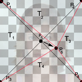
But suppose we wish to warp an image in some other way. If one wished, for example to develop a "morphing" utility that allows a point-by-point deformation of one image into another, then more fluid distortions are likely to be useful. The approach presented here uses individualized distortions on pieces of the image as it has been decomposed into clipPaths. The complete example is rather complex and may be seen at this location, but I will present an overview of the strategy used in hopes to help the reader make sense of the rather lengthy code seen there. We begin by partitioning the image into four triangular clipPaths. Each triangle (T1 through T4) consists of one point, P5, at the center of the image, and the other two points along one of its four edges. The "warping" effect we seek is one which, while leaving all points on the outside of the rectangle fixed, remaps the center point P5 to a new point P6, chosen by the user through mouse activity.
| a | b | c |
| d | e | f |
| 0 | 0 | 1 |
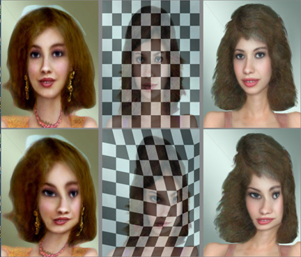
] and M x P1 = P1 ; M x P2 = P2 and M x P5 = P6. Pj (for j = 1,2,5,6) may be represented as [xj, yj, 1] . The result is ultimately six equations with six unknowns, and unique solutions for a,b,c,d,e, and f may be found for a given value of P6. The equations are a bit tedious to calculate (using pedestrian approaches took about 1 page of work for each of the four triangles) but it is work, that ultimately an undergraduate without much math beyond introductory college algebra can follow and perhaps perform. The working example at this location is noteworthy for how fast it works in Safari, Opera and IE/ASV. (It works in FF3 as well, but a bit sluggishly). Below is a comparison of two screen shots, before and after mouse movement.
Another approach that I have investigated is the use of feDisplacement and feOffset filters to warp images, but the fact that the underlying filters are either radial or linear tends to impose a similar restriction on the transformations as does the affineness of the native transformations. Additionally, it should be observed that it is not (to my way of understanding) trivial to figure out quite how far an feDisplacement will actually send a given pixel, despite the quantitative nature of the transform. (See displace2, displace4, displace7, and offsets7 for experiments along these lines.)
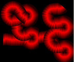
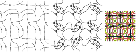
This investigates methods of stitching together various segments of knots to create a non-deterministic fabric of traversable threads. Let me explain. Some years ago I proved a couple of theorems. One demonstrated that three coloration of four-regular planar graphs was NP-complete [Dailey1]. Another [Dailey2] showed that the coursing of trichromatic data through planar graphs could be used to build logic gates (and, or, neither-nor and the like). The notion that locally very simple networks can, in some global way, contain enough complexity to model the most complex of problems has intrigued me for years. It also happens that many highway networks can be viewed as four-regular planar graphs (the five or six-way intersection is rather the anomaly, while interstate overpasses have added a nonplanar nature to terrestrial travel). One may consider the ability to construct random examples of such graphs, therefore, as beneficial to algorithm testing both in areas of computational complexity and traffic routing. With that in mind, I became interested in collections of tiles (each containing small four regular subgraphs) which when tiled together in the plane might generate interesting and representative classes of four-regular planar graphs. Some of my earlier investigations into these matters (for example quasi-random wallpaper, or tiling the plane with knots ) used a collection of bitmaps that tessellated seamlessly in any orientation. Selecting random tiles, or random orientations of a given tile, produces interesting classes of graphs and networks. I suspect, but have yet to prove that the 3-coloration of such graphs (as constructed from a small collection of tiles) is NP-complete.
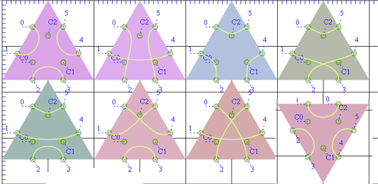
For two points on the exterior of each side of a square there are 34 possible tiles (these were constructed manually for the example shown at quasi-random wallpaper, ). The problems with using bitmaps for the tilings are that they take a long time to draw by hand, and once drawn the connective structure (that affiliates one point on the edge with another) is not available to the program. I hence rebuilt the 34 square tiles in SVG, and experimented with embedding them (using various subsets) and rotating them in this example . These can be illustrated (with one inexplicably missing) as shown.
pair[0]=[0,3,1,4,2,5] //three crossings
	pair[1]=[0,2,1,4,3,5] //two crossings
	pair[2]=[0,5,1,3,2,4] //one crossing
	pair[3]=[0,4,1,5,2,3] //one crossing
	pair[4]=[0,5,1,4,2,3] //no crossings
	pair[5]=[0,5,1,2,3,4] //three corners
	pair[6]=[0,1,2,3,4,5] //three sides
	pair[7]=[0,4,1,3,2,5] //rotation of 1
	pair[8]=[0,3,1,5,2,4] //rotation of 1
	pair[9]=[0,2,1,5,3,4] //rotation of 2
	pair[10]=[0,4,1,2,3,5] //rotation of 2
	pair[11]=[0,1,2,4,3,5] //rotation of 3
	pair[12]=[0,2,1,3,4,5] //rotation of 3
	pair[13]=[0,1,2,5,3,4] //rotation of 4
	pair[14]=[0,3,1,2,4,5] //rotation of 4
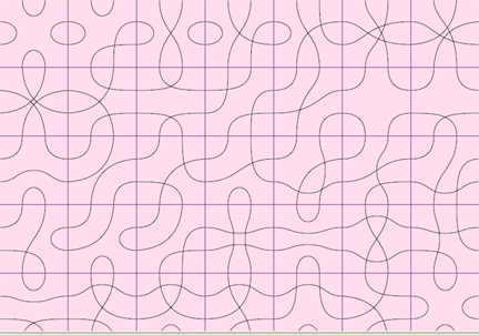
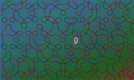
Pairings #5 and #6 (shown as the third and first pictures in Figure 29 above) are self-symmetric so that rotating them makes no difference. Likewise with pairing #0 (tile #7 in Figure 29). Other tilings all have nontrivial rotations and are, hence worthy of being overtly constructed. We may then use the three control points in the center of the circles for construction of cubic bezier curves to connect the various endpoints. For the purpose of tiling, we wish each of the curves to be perpendicular to both of the edges it connects. The appropriateness of this approach is demonstrated in this example. We then merely need to tile these 15 tiles together randomly as illustrated in the current state of progress for this approach. A small oval is then animated and set to follow a path. It is animated along the bezier segment. The animation terminates, and consistent with the methods discussed in the section on "Reusing animations" earlier in this paper, it then activates a function which determines which edge it has ended up on. I did not succeed, yet, in getting the oval to identify which of the segments within the new triangle it actually abuts against (in part since half of the triangles are rotated 60 degrees for purposes of tiling). And to avoid the problem that small loops often exist in the roadway thusly constructed, I have left the example as it is. An illustration of what the page looks like is shown below. Ultimately, the application becomes more relevant as the braidings become more interconnected, such as would be the case using some of the more densely connected fabrics shown in the earlier example, but the majority of the problem we set out to solve has been accomplished.
