Clip-paths*and Masks
Like the slightly more complex <mask> (that we'll introduce later), the <clipPath> tag gives us a way to define a collection of shapes that may be used to carve a given figure into more interesting shapes. A clip-path may be applied to any drawn objects in SVG including groups of objects, and the clip-path itself can consist of many shapes. Masks are a lot like clip-paths, but more flexible. We'll show just one simple example of masks here, and let the SVG Primer lead you further if you are interested.
Some of the experiments with gradients might suggest that we
can use stop-opacity of a gradient to simulate certain kinds of
cropping or clipping.
 |
 |
 |
<image x="15%"
width="30%" y="15%" height="30%"
|
<radialGradient id="r"
fy=".55" >
|
<radialGradient id="r"
fy=".55" >
|
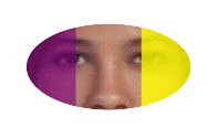
| A simple bitmap imported into SVG through <image> | A gradient with transparent center. | Overlaying the two |
|---|
This serves to illustrate some of the power of gradients, but it should be fairly straightforward to conclude that using linear and radial gradients (the only kind available in SVG at present) to "clip" an image down to an arbitrary shape will not be easy!
Here's the above effect but swapping in a different image:
A similar effect can be just as easily accomplished in the following way
<clipPath
id="CP">
|
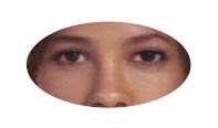
Picture of clipped bitmap |
Basically, we can see from the above example, that like gradients, tags are put inside a <clipPath> and then the clip-path can be applied (through its "id") to the object or group of objects to be clipped.
Let's try something like that with a group of objects:
<clipPath
id="CP">
|
 |
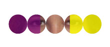
Next, we will see an example that clearly differentiates between what we might accomplish with clip-paths as opposed to gradients. In the following example we insert numerous ellipses into the clip-path showing that the clipped regions may be complex.
<clipPath
id="CP">
|
 |
Following this example, one might be tempted to try something like the following:
<clipPath id="CP">

<g id="U">

<ellipse cx="19%" cy="25%" rx="2.5%"
ry="4%" />

<ellipse cx="24%" cy="25%" rx="2.5%"
ry="4%" />

<ellipse cx="29%" cy="25%" rx="2.5%"
ry="4%" />

<ellipse cx="34%" cy="25%" rx="2.5%"
ry="4%" />

<ellipse cx="39%" cy="25%" rx="2.5%"
ry="4%" />

</g>

<use xlink:href="#U" transform="translate(0,40)"
/>

<use xlink:href="#U" transform="translate(0,80)"
/>

</clipPath>
However, by the SVG specification 1.1, the content of a clipPath cannot involve either groups (<g>) or complex uses (<use>). A clip-path is limited to either simple drawn objects, or to reuses of simple drawn objects. If we wanted to reuse content as above, we could do so through a <mask> as follows:
<mask id="CP">
|
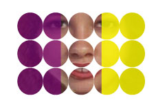 |
In this example the white ellipses act exactly like the positive parts of the clip-path that include content of the affected image. Parts of the images corresponding to black or unfilled parts of the mask are completely excluded.
While a clip-path declares that content is either inside it (and hence visible) or outside it (and hence invisible) a mask allows degrees of visibility, depending on the brightness of the objects inside the mask. Herewith is a fairly complex example that places a reflected gradient inside a mask so that opacity values of the affected image undergo gradual transitions across the bands of the gradient:
<radialGradient
id="G1" cx="29%" cy="27%" r="45" fy="50%"
|
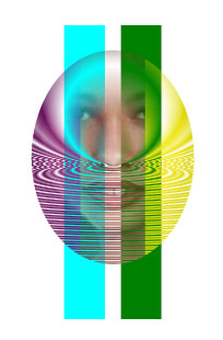 |
*I am never quite sure whether to type "clippaths" or "clip-paths." In SVG there is a tag <clipPath> and an attribute clip-path. To my way of thinking , "clip-path" sounds a bit more consistent with English spelling (if anyone would be so brave as to suggest that this strange language has anything resembling spelling rules). I probably will not be consistent with myself, though.