Animating a transform
It turns out that there is a better way of rotating objects
than by animating the stroke. <animateTransform> can be
used to change either the scale, position or rotation of an object.
Observe this nifty
extension of the above example that appears (to run at
different speeds in Firefox and the other browsers), but let's examine
a simpler case in more detail:
|
|
|
<ellipse
id="One" cx="200" cy="100" rx="30" ry="40" fill="#555">
<animate
attributeName="rx" type="rotate"
dur="5s" values="50;20;50" repeatCount="indefinite"/>
<animate attributeName="ry" type="rotate"
dur="5s" values="10;60;10" repeatCount="indefinite"/>
</ellipse>
<use id="Two" xlink:href="#One" fill-opacity=".35" stroke="#d06"
stroke-width="3">
<animateTransform
attributeName="transform"
type="rotate" dur="5s"
from="0
200 100" to="360 200 100"
repeatCount="indefinite"/>
</use>
<use xlink:href="#One" transform="translate(100,0)" />
<use xlink:href="#Two" transform="translate(-100,0)" /> |
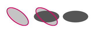
In this example, we've taken a basic ellipse ("One") colored
dark grey (#555) and animated both its x and y radii. We then re-use it
three times: once in the same location ("Two"), once to the left and
once to the right. This allows us to see that the two grey ellipses
oscillate only vertically and horizontally. The reddish ellipses,
though, both have an animateTransform applied so that they may be
rotated as well. Note how they are rotated about their
centers. Here is a more
adventurous example (working best in FF4, Opera or IE/ASV)
using similar ellipses that both oscillate and rotate as a part of a
clipPath applied to an image that is then tiled through a pattern.
Another more complex example illustrates that we might animating both
rotation and scaling, but, if we do so, the center will move (because
of the scaling), so we also need to translate to keep the objects in
place:
|
|
|
|
<path
id = "P2" stroke = "black" stroke-width = "2" opacity = ".6" fill =
"#c77"
d = "M 150 220
C 145 244 146 251 135 260 C 124 269 114 287 134 282
C 154 277 162 279 159 288 C 156 297 135 305 148 308
C 161 311 185 315 172 315 C 159 315 150 309 147 314
C 144 319 159 322 156 327 C 153 332 141 348 153 354
C 165 360 185 361 194 354 C 203 347 214 357 212 368
C 210 379 196 400 204 400 C 212 400 237 396 250 394
C 263 392 279 374 276 353 C 273 332 276 308 286 289
C 296 270 325 240 321 215 C 317 190 304 179 286 158
C 268 137 253 111 216 120 C 179 129 163 144 150 170
C 137 196 150 210 160 212 C 170 214 160 222 150 220
" >
<animateColor
attributeName="fill" dur="5s"
values="#ff8; #f88; #f8f; #88f; #8ff;
#8f8" repeatCount="indefinite"/>
<animateTransform attributeName="transform"
repeatCount="indefinite"
type="translate" dur="4s"
values="0,0;-110,-140;0,0"/>
<animateTransform attributeName="transform"
repeatCount="indefinite"
additive="sum" type="scale" dur="4s"
values="1;1.5;1"/>
<animateTransform attributeName="transform"
repeatCount="indefinite"
additive="sum" type="rotate" dur="7s"
values="0,216 242;360 216 242" />
</path> |
In order to do this, we require that the attribute
additive="sum"
be set to prevent the previous animations from being ignored.
Some calculation to determine just how far the translate must
compensate for the scaling operation, must clearly be done. It would be
very nice if SVG 2.0 had a way to both scale and rotate while keeping
either the center of the bouncing box, or the center of gravity fixed.