CSS Rule Quick Reference
Table of contents
- Font property
- Text property
- Background property
- Box property
- Border property
- List property
- Table property
- Layout, position, and visual effect property
- Generated content and automatica numbering property
- Linear and radial gradient
- Transition property
- Animation property
- Transform property
- User interface property
Font property
| Property | Meaning | Value | Example |
|---|---|---|---|
| font-family | A prioritized list of specific/generic font family names. |
|
font-family: "Times New Roman" |
| font-size | Font size |
|
font-size: 24pt; |
| font-style | Font style |
|
font-style: italic; |
| font-variant | Normal font variant or small-caps variant |
|
font-variant: small-caps; |
| font-weight | Font weight |
|
font-weight: bold; |
| font | A shorthand property for font setting |
|
font: bold italic small-caps 24px "New Century Schoolbook", serif; |
Text property
| Property | Meaning | Value | Example |
|---|---|---|---|
| color | The color of text |
|
This paragraph shows the effect of color: rgba(100%, 0%, 0%, 0.5), which is light red. |
| text-shadow | The shadow effect of text in an element |
|
This paragraph shows the effect of text-shadow: 5px 5px 3px rgba(0,0,0, 0.3). |
| text-indent | The indentation of the first line of text in a block element |
|
This paragraph shows the effect of text-indent: 2em. More text are necessary in this paragraph. |
| text-align | The horizontal alignment of text in a block element |
|
This paragraph shows the effect of text-align: center. More text are necessary in this paragraph. |
| vertical-align | The vertical positioning of an elment's box relative to its parent element |
|
This paragraph shows the effect of vertical-align: 10px relative to some text. |
| text-decoration | The decoration added to the text |
|
This paragraph shows the effect of text-decoration: overline. |
| text-transform | The capitalization of the text |
|
This paragraph shows the effect of text-transform: uppercase. |
| letter-spacing | The spacing behavior between text characters |
|
This paragraph shows the effect of letter-spacing: 5px. |
| word-spacing | The spacing behavior between words |
|
This paragraph shows the effect of word-spacing: 5px. |
| white-space | The handling of white spaces in the text |
|
This paragraph shows the effect of white-space: pre-line. This sentence contains 5 spaces. This sentence contains a newline. |
| direction | The text/writing direction |
|
This paragraph shows the effect of direction: rtl. |
Background property
| Property | Meaning | Value | Example |
|---|---|---|---|
| background-color | The background color of an element |
|
This paragraph shows the effect of background-color: #FFC. |
| background-image | The background image of an element |
|
This paragraph shows the effect of background-image: url(bkimg.png). |
| background-repeat | Repeating pattern of background image |
|
This paragraph shows the effect of background-image: url(bkimg.png); background-repeat: repeat-x. |
| background-position | The initial position of background image |
|
This paragraph shows the effect of background-image: url(bkimg.png); background-position: top right. |
| background-attachment | Scrolling behavior of background image |
|
This paragraph shows the effect of background-image: url(bkimg.png); background-attachment: fixed. I need more text to show this effect. So I will put more words, phrases, sentences. In addition to background image setting, I also specified the height of this paragraph to be 50px. The overflow property is set to auto to show the vertical scroll bar. |
| background-clip | Painting area of background image |
|
This paragraph shows the effect of background-image: url(bkimg.png); background-clip: content-box. In addition to background image setting, I also show border box and specify the padding to be 5px. |
| background-size | The size of background image |
|
This paragraph shows the effect of background-image: url(bkimg.png); background-size: cover. |
| background | A shorthand property to set background color or background image |
|
Box property
| Property | Meaning | Value | Example |
|---|---|---|---|
| box-sizing | The interpretation of width and height property of an element |
|
|
| width | The width of an element |
|
This paragraph shows the effect of width: 40px. |
| height | The height of an element |
|
|
| padding-top/padding-right/padding-bottom/padding-left | The size of padding (the space between border and content area) |
|
This paragraph shows the effect of padding-top: 50px. The borderline is also displayed to show the effect. |
| padding | A shorthand property for the size of all four padding areas |
|
This paragraph shows the effect of padding: 1em 2em. The borderline is also displayed to show the effect. |
| margin-top/margin-right/margin-bottom/marging-left | The size of margin area (the extra spacing outside the border) |
|
This paragraph shows the effect of margin-top: 50px. The borderline is also displayed to show the effect. |
| margin | A shorthand property for the size of all four margin areas |
|
This paragraph shows the effect of margin: 1em 2em. The borderline is also displayed to show the effect. |
Border property
| Property | Meaning | Value | Example |
|---|---|---|---|
| border-top-width/border-right-width/border-bottom-width/border-left-width | The width of the border line |
|
This paragraph shows the effect of border-bottom-width: 2px. The style of the border line also needs to be set. |
| border-width | The width of the all four border lines |
|
This paragraph shows the effect of border-width: 4px 2px. The style of the border line also needs to be set. |
| border-top-color/border-right-color/border-bottom-color/border-left-color | The color of the border line |
|
This paragraph shows the effect of border-bottom-color: blue. The style of the border line also needs to be set. |
| border-color | The color of the all four border lines |
|
This paragraph shows the effect of border-color: blue yellow. The style of the border line also needs to be set. |
| border-top-style/border-right-style/border-bottom-style/border-left-style | The line style of the border |
|
This paragraph shows the effect of border-bottom-style: dotted. |
| border-style | The line style of the all four borders |
|
This paragraph shows the effect of border-style: solid dashed dotted. |
| border | A shorthand property to set width, style, and color of the all four borders |
|
This paragraph shows the effect of border: 2px solid blue. |
| border-top-left-radius/border-top-right-radius/border-bottom-right-radius/border-bottom-left-radius | The radius of rounded border corner |
|
This paragraph shows the effect of border-top-left-radius: 20px 15px. The style of the border line also needs to be set. |
| border-radius | The radius of all four rounded border corners |
|
This paragraph shows the effect of border-radius: 20px 10px / 20px 10px. The style of the border line also needs to be set. |
| border-image-source | The name of an image file. |
|
|
| border-image-slice | The slicing of the image into a 3 × 3 grid |
|
This pargraph shows the effect of border-width: 30px; border-image-source: url(bdimg.png); border-image-slice: 30. |
| border-image-width | The slicing of border image area into a 3 × 3 grid |
|
This pargraph shows the effect of border-width: 30px; border-image-source: url(bdimg.png); border-image-slice: 30; border-image-width: 15px. |
| border-image-outset | The extra area beyond the border box for border image area |
|
This pargraph shows the effect of border-width: 15px; border-image-source: url(bdimg.png); border-image-slice: 30; border-image-width: 30px; border-image-outset: 2. |
| border-image-repeat | Repeating pattern of image slice for horizontal and vertical borders |
|
This pargraph shows the effect of border-width: 15px; border-image-source: url(bdimg.png); border-image-slice: 30; border-image-repeat: space stretch. |
| border-image | A shorthand property of border image setting |
|
This paragraph shows the effect of border-width: 15px; border-image: url(bdimg.png) 30 repeat stretch. |
| box-shadow | Box shadow setting |
|
This paragraph shows the effect of border: 2px solid black; box-shadow: 3px 3px 5px 3px rgba(0, 0, 0, 0.3). |
List property
| Property | Meaning | Value | Example |
|---|---|---|---|
| list-style-type | Appearance of list item marker |
|
|
| list-style-image | Image used as list item marker |
|
|
| list-style-position | Position of marker box relative to the principal block box |
|
|
| list-style | A shorthand property of list item marker setting |
|
|
Table property
| Property | Meaning | Value | Example |
|---|---|---|---|
| table-layout | The algorithym used to lay out table cells |
|
|
| border-collapse | Table's border model |
|
|
| border-spacing | Spacing between cells' borders |
|
|
| empty-cells | Rendering of borders and background of cell without visiable contents in separate model |
|
|
| caption-side | Position of the caption |
|
Layout, position, and viusal effect property
| Property | Meaning | Value | Example |
|---|---|---|---|
| float | Floating of a box |
|
This paragraph shows the effect of float: left. This is the paragraph that is not floating, but with the margin-left: 220px. |
| clear | Adjacency to a floating box |
|
This paragraph shows the effect of float: left. This paragraph shows the effect of float: right. If I put more sentences here, it can grow to the right of the third paragraph. This paragraph shows the effect of clear: left. |
| position | Positioning of a box |
|
This paragraph shows the effect of position: relative; left: 50px. |
| top/right/bottom/left | Relative offset or absolute positioning of the box |
|
This paragraph shows the effect of position: relative; left: 50px. |
| z-index | Stacking order of a box |
|
This paragraph goes before the image. However, the z-index of the image is -1.  |
| clip | Clipping area of absolutely positioned element |
|
|
| overflow | Rendering of the contents outside box (when width/height is not big enough) |
|
|
| visibility | Visibility of element |
|
This paragraph shows the effect of visibility: hidden in the previous paragraph. |
| display | Rendering of element |
|
|
| opacity | Opacity of element |
|
This paragraph shows the effect of opacity: 0.5. |
| column-count | The number of columns |
|
This paragraph shows the table cell's effect of column-count: 2; -moz-column-count: 2; -webkit-column-count: 2. |
| column-width | The width of columns |
|
This paragraph shows the table cell's effect of column-width: 100px; -moz-column-width: 100px; -webkit-column-width: 100px. |
| column | A shorthand property of column setting |
|
|
| column-gap | The size of gap between columns |
|
This paragraph shows the table cell's effect of column-count: 2; column-gap: 2em; -moz-column-count: 2; -moz-column-gap: 2em; -webkit-column-count: 2; -webkit-column-gap: 2em. |
| column-rule-color | The color of column rule |
|
|
| column-rule-style | The style of column rule |
|
|
| column-rule-width | The width of column rule |
|
|
| column-rule | A shorthand property of column rule |
|
This paragraph shows the table cell's effect of column-count: 2; column-rule: 2px blue dashed; -moz-column-count: 2; -moz-column-rule: 2px blue dashed; -webkit-column-count: 2; -webkit-column-rule: 2px blue dashed. |
| break-before/break-after/break-inside | The page/column break behavior before/after/inside the generated box |
|
Generated content and automatic numbering property
| Property | Meaning | Value | Example |
|---|---|---|---|
| content | Generate content used with ::before and ::after pseudo-elements |
|
|
| counter-reset | Reset a counter variable |
|
|
| counter-increment | Increase a counter variable |
|
Linear and radial gradient
| Rule | Value | Example |
|---|---|---|
| Linear gradient |
|
This paragraph shows the effect of background: linear-gradient(45deg, rgba(255, 255, 0, 0.3) 10%, rgba(0, 0, 255, 0.3) 90%). I also outlined the border of the paragraph and set the height to be 100px. |
| Radial gradient |
|
This paragraph shows the effect of background: radial-gradient(circle farthest-side, rgba(255, 255, 0, 0.3) 10%, rgba(0, 0, 255, 0.3) 90%). I also outlined the border of the paragraph and set the height to be 100px. |
| Repeating linear gradient |
|
This paragraph shows the effect of background: repeating-linear-gradient(45deg, rgba(255, 255, 0, 0.3) 0px, rgba(0, 0, 255, 0.3) 50px, rgba(255, 255, 0, 0.3) 100px). I also outlined the border of the paragraph and set the height to be 100px. |
| Repeating radial gradient |
|
This paragraph shows the effect of background: repeating-radial-gradient(circle 50px, rgba(255, 255, 0, 0.3) 0%, rgba(0, 0, 255, 0.3) 50%, rgba(255, 255, 0, 0.3) 100%)). I also outlined the border of the paragraph and set the height to be 100px. |
Transition property
To use CSS transition, two states are styled for the same element. One is normal state, the other is a special state, such as :hover state. For FireFox browser, use -moz-* properties.
| Property | Meaning | Value | Example |
|---|---|---|---|
| transition-property | CSS properties to be animated |
|
transition-property: border |
| transition-duration | How long it takes for transition |
|
transition-duration: 5s; |
| transition-delay | How long it waits to start transition |
|
transition-delay: 2s; |
| transition-timing-function | How animation proceeds |
|
transition-timing-function: ease; |
| transition | A shorthand property to set tansition |
|
If you move the cursor over or out of this paragraph, the border will appear and disappear. The style for this paragraph is #transitionP { border: 0px solid blue; transition-property: border; transition-duration: 5s; transition-delay: 2s; transition-timing-function: ease; } #transitionP:hover { border: 50px solid blue; } |
Animation property
To use CSS animation, some key frames of the anmiation need to be defined with @keyframes rule. The syntax of the @keyframes rule is:
@keyframes animation-name {
    0% { ... }
    ...
    100% { ... }
  }
This animation above defined two key frames: a set of CSS rules at the start of the anmiation, the other set at the end. More key frames can be defined with CSS rules at different anmiation moment with a percentage value. 0% time moment is named "from", while 100% named "to". At least these two key frames are necessary.
For Chrome and Safari browsers, use -webkit-* properties.
| Property | Meaning | Value | Example |
|---|---|---|---|
| animation-name | A list of animations to apply |
|
@keyframe backgroundChange { from { background-color: lightBlue; } to { background-color: lightcyan; } } animation-name: backgroundChange; |
| animation-duration | The length of animation |
|
animation-duration: 5s; |
| animation-timing-function | How animation proceeds |
|
animation-timing-function: linear; |
| animation-iteration-count | The number of times an animation is played |
|
|
| animation-direction | The way animation is played |
|
|
| animation-play-state | If the animation is played or paused |
|
|
| animation-delay | When the animation starts |
|
|
| animation-fill-mode | The effect of starting and ending key frames |
|
|
| animation | A shorthand property to set animation |
|
The background color of this paragraph constantly changes from lightBlue to lightCyan in 5 seconds and then vice versa. The animation backgroundchange is defined as @keyframes backgroundchange { from { background-color: lightBlue; } to { background-color: lightCyan; } }. The style of the paragraph is animation: backgroundchange 5s ease infinite alternate; -webkit-animation: backgroundchange 5s ease infinite alternate. |
Transform property
| Property | Meaning | Value | Example |
|---|---|---|---|
| transform | Transformation |
|
The picture below shows the effect of transform: translate(20px, 20px); -webkit-transform: translate(20px, 20px). The bottom margin of this paragragh is 50px. 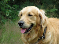 |
| transform-origin | The origin of transformation |
|
The picture below shows the effect of transform-origin: 0px 0px; -webkit-transform-origin: 0px 0px; transform: rotate(15deg); -webkit-transform: rotate(15deg)The bottom margin of this paragragh is 50px. |
| perspective | Perspective transform |
|
|
| perspective-origin | The origin of perspective transform |
|
The style of this table cell is perspective: 100px; -webkit-perspective: 100px; perspective-origin: 0% 100%; -webkit-perspective-origin: 0% 100%. The picture below shows the effect of perspective: 100px; -webkit-perspective: 100px; transform: rotateX(30deg); -webkit-transform: rotateX(30deg);. The bottom margin of this paragragh is 50px. |
| backface-visiblity | The visibility the backface of the element |
|
The picture belows shows the effect of transform: rotateY(180deg); -webkit-transform: rotateY(180deg); backface-visibility: hidden; -webkit-backface-visibility: hidden. So it is invisible. |
The following 2D transform functions are used for transform property. For Chrome and Safari browsers, they use -webkit-transform property.
| Function name | Meaning | Value | Example |
|---|---|---|---|
| translate() | 2D translation |
|
The picture below shows the effect of transform: translate(20px, 20px); -webkit-transform: translate(20px, 20px). The bottom margin of this paragragh is 50px. |
| translateX()/translateY() | 2D translation along X/Y axis |
|
The picture below shows the effect of transform: translateX(50px); -webkit-transform: translateX(50px). The bottom margin of this paragragh is 50px. |
| scale() | 2D scale operation |
|
The second picture below shows the effect of transform: scale(1.5); -webkit-transform: scale(1.5). The bottom margin of this paragragh is 50px.
|
| scaleX()/scaleY() | 2D scale operation |
|
The second picture below shows the effect of transform: scaleX(1.5); -webkit-transform: scaleX(1.5). The bottom margin of this paragragh is 50px.
|
| rotate() | 2D rotation around the origin of the element |
|
The second picture below shows the effect of transform: rotate(30deg); -webkit-transform: rotate(30deg). The bottom margin of this paragragh is 50px.
|
| skew() | 2D skew |
|
The second picture below shows the effect of transform: skew(30deg, 15deg); -webkit-transform: skew(30deg, 15deg). The bottom margin of this paragragh is 50px.
|
| skewX()/skewY() | 2D skew transformation along X or Y axis |
|
The second picture below shows the effect of transform: skewY(15deg); -webkit-transform: skewY(15deg). The bottom margin of this paragragh is 50px.
|
| matrix() | 2D transformation in the form of a transformation matrix |
|
The following 3D transform functions are used for transform property. For Chrome and Safari browsers, they use -webkit-transform property.
| Function name | Meaning | Value | Example |
|---|---|---|---|
| translate3d() | 3D translation |
|
The style of the table cell is perspective: 100px; -webkit-perspective: 100px; perspective-origin: 0% 100%; -webkit-perspective-origin: 0% 100%.The second picture below shows the effect of transform: translate3d(20px, 20px, 20px); -webkit-transform: translate3d(20px, 20px, 20px).
|
| translateZ() | 3D translation along Z axis |
|
The style of the table cell is perspective: 100px; -webkit-perspective: 100px.The second picture below shows the effect of transform: translateZ(20px); -webkit-transform: translateZ(20px).
|
| scale3d() | 3D scale operation |
|
|
| scaleZ() | 3D scale operation along Z axis |
|
|
| rotate3d() | 3D rotation |
|
The style of the table cell is perspective: 100px; -webkit-perspective: 100px; perspective-origin: 0% 100%; -webkit-perspective-origin: 0% 100%.The second picture below shows the effect of transform: rotate3d(1, 1, 1, 30deg); -webkit-transform: rotate3d(1, 1, 1, 30deg).
|
| rotateX()/rotateY()/rotateZ() | 3D rotation along an axis |
|
The second picture below shows the effect of transform: rotateX(45deg); -webkit-transform: rotateX(45deg).
|
| matrix3d() | 3D transformation in the form of a 4 × 4 homogeneous matrix |
|
User interface property
| Property | Meaning | Value | Example |
|---|---|---|---|
| cursor | The shape of cursor |
|
The paragraph shows the effect of cursor: crosshair. |
| resize | If and how the element can be resized by the user |
|
|
| text-overflow | Rendering of overflown in-line content |
|
|
| outline-width | The width of element's outline |
|
|
| outline-style | The style of element's outline |
|
|
| outline-color | The color of element's outline |
|
|
| outline | A shorthand property to set the element's outline |
|
The outline of this text box below is outline: blue dotted 1px. |
References
- Cascading Style Sheets Level 2 Revision 1 (CSS 2.1) Specification
- CSS Color Module Level 3
- CSS Text Decoration Module Level 3
- CSS Backgrounds and Borders Module Level 3
- CSS Image Values and Replaced Content Module Level 3
- CSS Transitions
- CSS Transforms
- CSS Basic User Interface Module Level 3
- CSS Multi-column Layout Module
- CSS Animations
- CSS
- Jason C. Teague, CSS3: Visual QuickStart Guide, 5th edition
- Peter Gasston, The Book of CSS3: A Developer's Guide to the Future of Web Design