Breaking the Rectilinear Mold
Tansy: Web Layout Parisien
(Open Source Javascript and SVG)
David
Dailey,
Dan Miller, Hope Koutsouflakis
Slippery Rock University
Contents
Abstract
The
concept of hypertext has succeeded in transforming the linear text of
antiquity
into the more modern technologies of web-based communication.
Nonetheless, on
the fiftieth anniversary of hypertext, we are still stuck in boxes.
Ideas do not always fit in rectangles, and the graph theoretic topology
of such things as much, flow charts, taxonomies, and more generally,
glyphs and art, do not always conform comfortably to our 15th century
legacy of rectangular typesetting. While even
the forward-looking SVG has embraced
a richer metaphor for human expression than its cousin, HTML, it too
has chosen
to remain inside the box, at least for the time being.
Fortunately,
scripted solutions can reveal that
not only are non-rectilinear designs for web pages and font-families
possible, but also that they may be just
as easily manipulated as working
within a box model. We demonstrate “the Paris street model” theory of
graphical
layout and show how it can be adapted both to the flow of web content
and to the
design of font-families.
For example: a series of SVG circles, when
dragged and resized, can be used to define and control a large
collection of
those lines tangent to pairs of circles. Up to four lines per pair of
circles
may be defined, so that a nonrectilinear geometry of up to 2n(n-1) lines may be easily controlled
through the use of n
circles. We show how both web design and font design may be liberated
from historic convention through simply throwing away the box.
Background:
Polygons,
Lines, and Rectangles
In
its earliest days, spatial communication among humans probably
consisted of
combinations of gestural language and signs including; drawings in
sand, on
trees, and on cave walls (like Lascaux), and simple sculptural work, as
with
clay. As the
development of pottery, metalsmithing, and paper progressed
and as cultures developed writing systems, the issues of how to tell
stories in
space (particularly on two-dimensional surfaces) encountered and solved
many
problems of how to convey ideas through pictures and text as those
pictures and
texts were forced to coexist within a shared space and shared medium.
It was
natural, but not universal, to divide space into rectangles, so as to
provide a
natural boundary between narrative and illustration. Nonetheless, in
part due
to the lack of literacy in the general population, the graphics were
often
primary, with text providing a secondary role, often helping to explain
the
graphics, where most of the message
resided. In such cases, the text often conformed to the shapes provided
by the
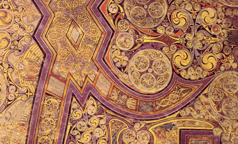
graphics, rather than vice versa. As seen in figure one, examples from
antiquity allowed text to conform to graphics, and in extreme examples,
such as
the Book of Kells, meaningful elements, both symbols and text, would
flow into
and around graphics, and those graphics were sometimes not only
meaningful, but
textual in nature. As seen, (figure one at right), early examples of
printing
with graphics, still let the shape of the text conform, somewhat to the
image, though this became unwieldy given the obvious constraints of the
linear flow of metal letters on their supports known as composing
sticks [1].
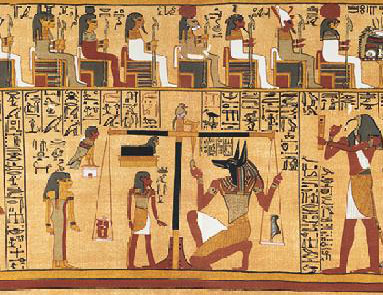 |
 |
 |
| Papyrus
circa 1250
BC, Thoth's declaration to the Ennead, based on the weighing of the
heart of the scribe Ani [2]. |
Chi-Rho monogram,
circa 800 AD, from Book of Kells [3]. |
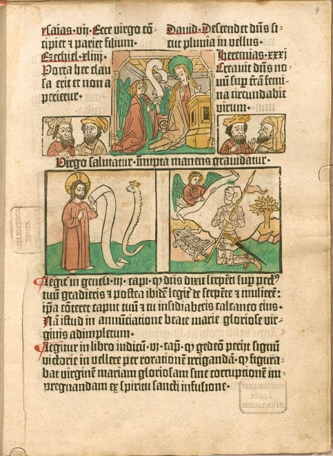
This Biblia Pauperum,
circa 1462, or "pauper's bible," is the first known work to combine the
woodcut images and movable type [4]. |
Figure
1 - separation of narrative and illustration using rectangles and other
shapes.
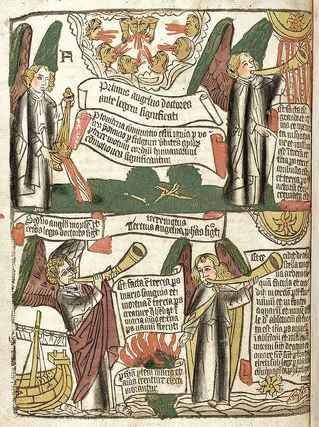 |
 |
| Apocalypse, dated
1400-1500. Page of a block book [5]. |
First incunable with
illustrations, Ulrich Boner's Der
Edelstein, printed by Albrecht Pfister, Bamberg, 1461 [6]. |
Figure
2 - separation of narrative illustration using rectangles and other
shapes.
As
the printing press came to dominate the European world of printing in
the 15th century, books were divided into two categories, text based
and image based. The latter, known as “block books,” were printed
through wood blocks in which the text like the illustration was hand
carved. The text, not being formed from movable metal letters, retained
the sense that text emphasized and explained the graphics. But with the
obvious mechanical constraints introduced by the printing press,
illustrations were difficult to insert into the printed page, and so
rectangles were reserved for those illustrations, making the
illustration subservient to the text [7]
[8].
Later
theorists, such as Kittler, and even McLuhan, wrote of the “monopoly of
the alphabet” introduced and enforced through printing, which largely
eliminated the role of the image from society [9].
As
history moved through its various evolutions from the early
printing press, to offset printing, to digital printing and the web,
society has largely maintained this legacy of rectangles of imagery
used in an auxiliary manner, to punctuate the, generally, larger
rectangles of text.
Historical
Ways of
Presenting Information
Throughout
history, many different sorts of documents have woven elements of
meaning and
form together in fascinating ways, which often involve the
juxtaposition of
semantic elements in shapes which are not merely rectangular. These
include
examples from many domains of expression including illuminated
manuscripts, illuminated letters, calligrams, calligraphic
arts, word
art, typographic puns, symbol arrangements, stained glass, mandalas,
coats of
arms, currency, mainstream art (including, for example, Native American
and modern,
such as Dadaism and cubism), software visualization
including flowcharts, mind-mapping,
posters, album covers, cartoons and even tattoos. A sampling
of some of these examples follows.
What is important to notice about all of these is that semantic elements, including text,
symbols, or meaningful decoration, are placed in space (in ways either
meaningful or decorative) without conforming to rectangular boundaries.
Illuminated
Manuscripts
Some
of the most noteworthy examples of the intermingling of semantic
elements with
non-rectangular geometry are found in illuminated manuscripts of the
early Middle Ages (For example see
http://en.wikipedia.org/wiki/Illuminated_manuscript). Those documents
frequently featured highly decorated text
interwoven with illustrations. Oftentimes,
the decorations were not merely decorative, but involved meaningful
symbols,
and in some cases, text, deformed into the contours of other semantic
elements.
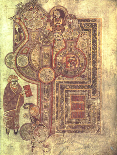
Among the most famous of the illuminated manuscripts is the Book of
Kells from
Ireland (or nearby islands) dating from about 800 A.D.
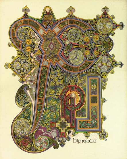
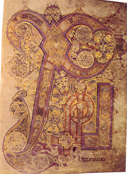 |
 |
| Book of Kells -- Chi
Rho [3] |
and detail [10]. |
Figure
3 - Illuminated Manuscript, Book of Kells
 |
 |
| Book of Kells,
Principit Matthew [3] |
and detail [10]. |
Figure
4 - Illuminated Manuscript, Book of Kells
The tradition of the
illuminated manuscript continues today in the work of some contemporary
artists. Note how, in the following example (circa 2010) by Sue Symons,
text
and graphics flow into and around other textual and graphical elements.
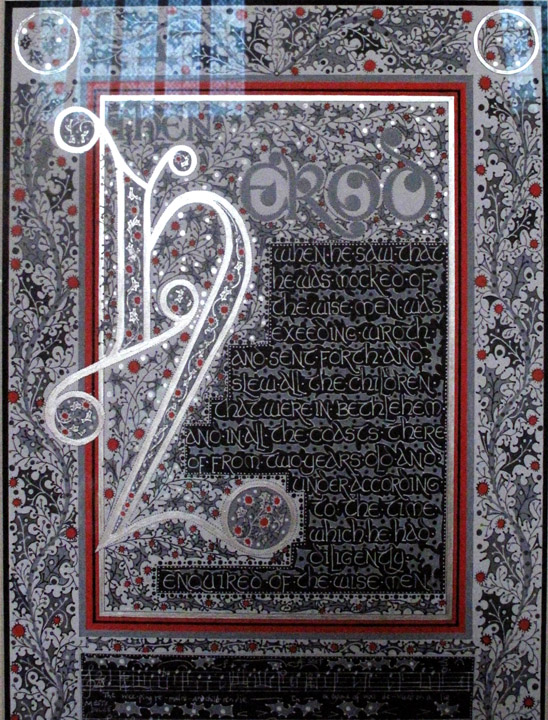
Figure
5 - Illuminated Manuscript [11].
Illuminated
Letters
Other examples in
which geometric shapes themselves have
meaning, and in which other meaningful, and perhaps decorative,
elements flow
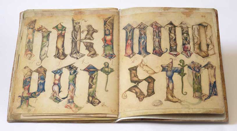
into those geometries, are shown in “Illuminated Letters.”
Figure
6 - Gothic letters from illuminated manuscript (ca. 1380) [12].
 |
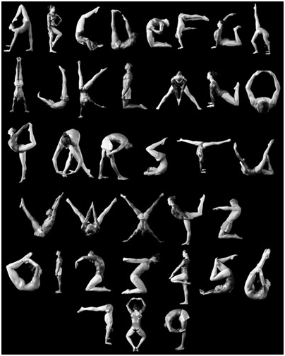 |
| Modern Example [14]. |
Alphabet Made from
Human Poses [15]. |
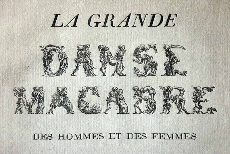 |
| La Grande Danse
Macabre [13]. |
Figure
7 - Other examples of illuminated letters dating from late medieval
period to modern times.
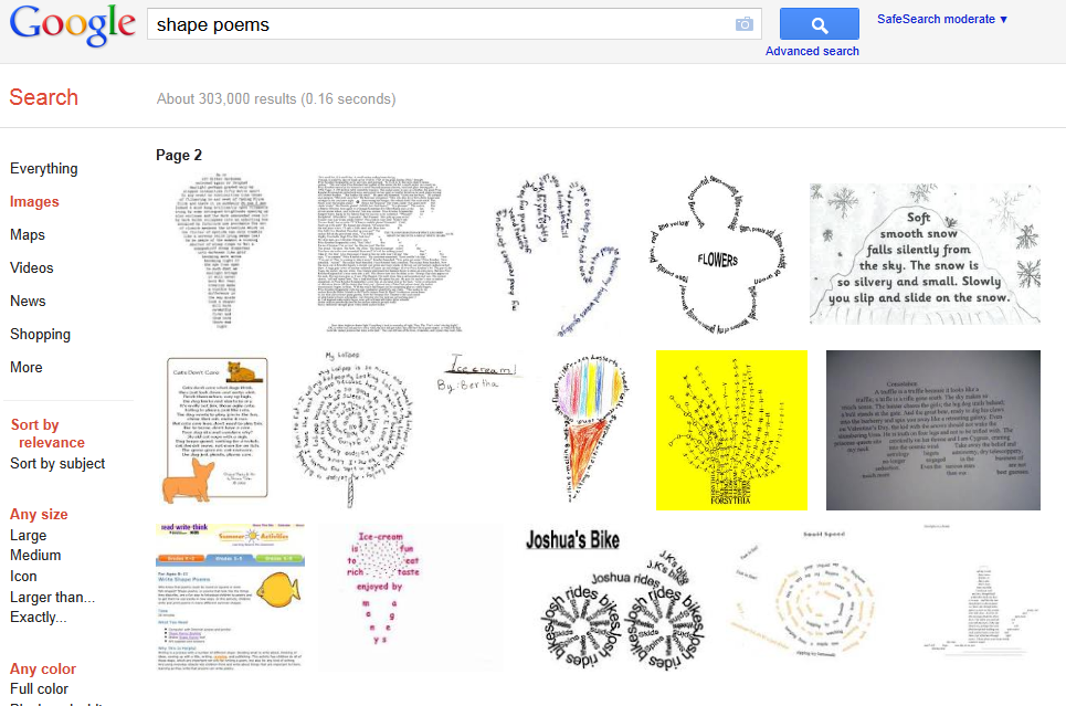
Word
Art
A
curious and diverse collection of modern examples can be seen in
various forms
of “word art” in which the shaping of words or texts and the meanings
of both
end up being correlated. Such word art includes things like shape
poems, typographic puns, and calligrams.
Figure 8 – Shape Poems,
examples of text flowing into shapes that illustrate an idea [16].
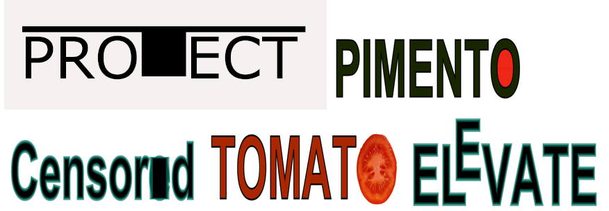
Typographic puns were popularized by Playboy Magazine
for a time during the 1950’s and 60’s, though there are
examples
from many cultures and from many eras, sharing some overlap with the
next subcategory, calligrams.
 |
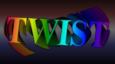 |
| Typographic
Puns as seen in "good" SVG viewer. |
The word TWIST, twisted by SVG/<replicate> |
Figure 9– Typographic Puns [17]
Calligrams
are often similar to typographic puns and shape poems, but are more
generally the placement of letters and words to form pictures. The
individual glyphs are often distorted to better conform to the
shape. This differs from shape poems where the positioning of
the
letters forms a picture. In both cases, the picture is often, but not
always, semantically related to the meaning of the text.
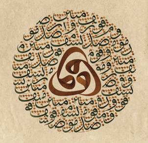
Calligraphy
Islamic
calligraphy has long been known for the beauty of its shapes and for
the dynamic and non-linear flow of its text. But examples of elaborate
flow of text exist in many cultures. We give just two examples here,
with a suggestion to the reader to do an Internet search for images
displaying “calligraphic art.”
 |
 |
| Turkish
Islamic Calligraphy [19]. |
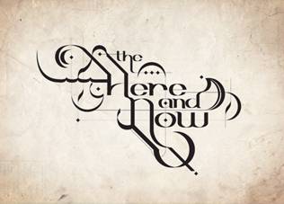
The Here and Now
– Calligraphy [20] |
Figure 11– Calligraphic Art
Examples.
Symbol
Arrangements
It
is important to remember that alphabets and other forms of script are
not the
only types of symbols that contain meaning. As in the Book of Kells and
in the
religious iconography of many religions, many of the symbols have
cultural
connotations that provide full-fledged semantics. Oftentimes, as with
the Book
of Kells, these symbols flow into patterns that are both nonlinear and
non-rectangular. Following is a simple illustration of this.
Figure 12 - tree vector
art: symbols in the shape of a tree [21].
Stained
Glass
Stained
glass windows, particularly those of the European churches of the late
Middle Ages and early Renaissance, tend to provide excellent instances
of the central premise: that symbols, text, and other meaningful
elements are arranged into shapes that defy the rectangular partition
of the plane.
Following
are three examples, two medieval and the other modern. All
show
Christian iconography that told stories of saints and the Bible, using
icons, often familiar to the worshippers, which identified the
participants. (For example, the use of crossed keys to signify Saint
Peter, see
http://en.wikipedia.org/wiki/Iconography#Christian_iconography).
 |
 |
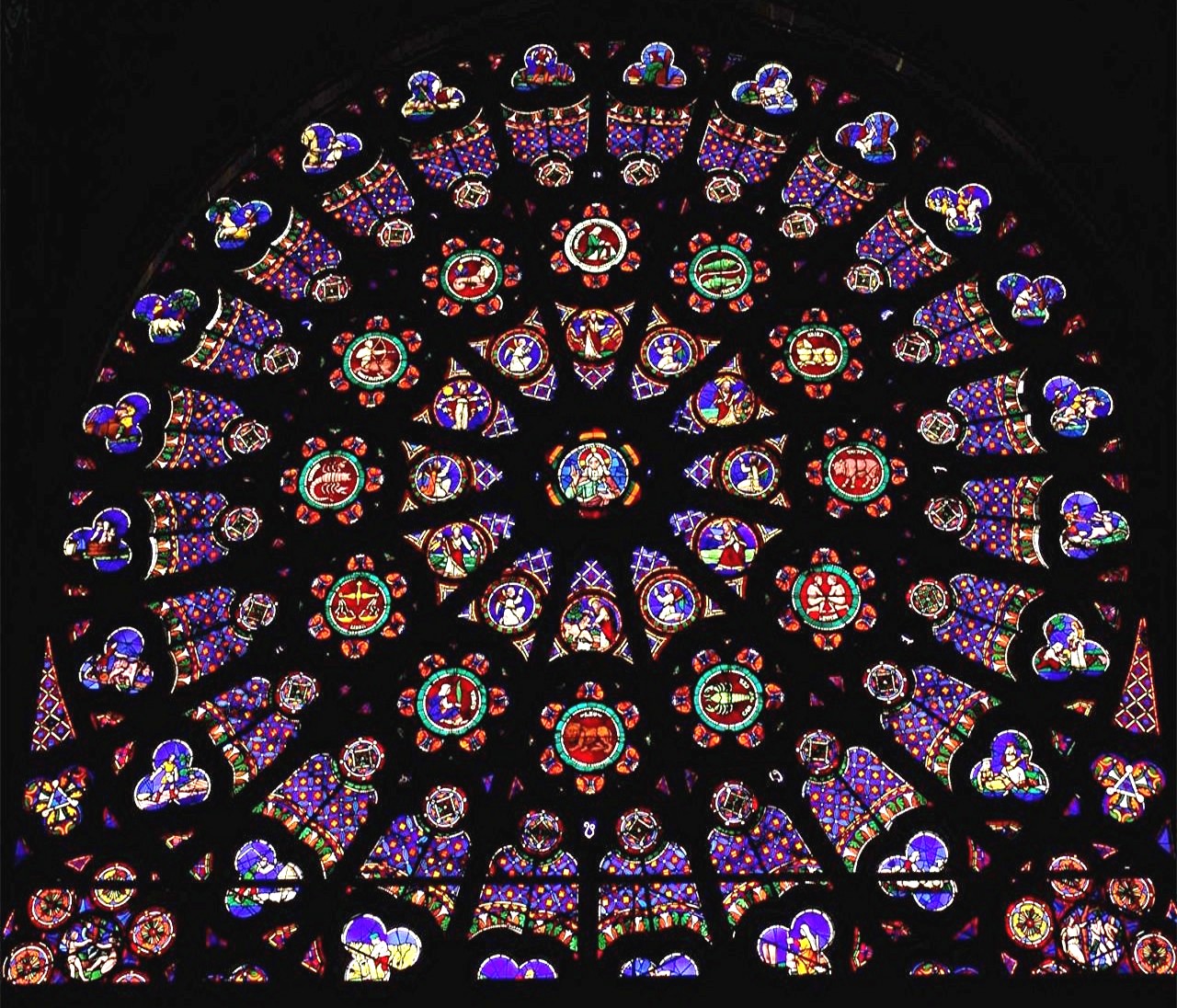 |
| Stained
Glass Window
from Chartres Cathedral [22]. |
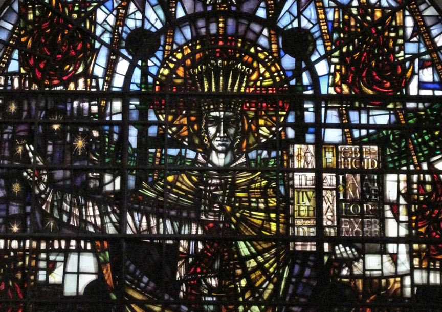
Contemporary
Stained
Glass window from St. Mary Aldermary Church, London [23]. |
North
Rose of the Abbey of St. Denis, Paris. "Symbolisom - showing God the
Creator, surrounded by the Days of Creation, the Order of the Heavens
represented by the Zodiac and the Order of Earth as represented by the
Labours of the Months. In the corners is the Fall of Mankind [24]." |
Figure
13 - Examples of Stained Glass
Currency
That
currency is filled with symbols, Masonic or otherwise, has been the
subject of speculation, cinema, and conspiracy theory for some time in
popular culture. Currency has long carried the combination of symbol,
icon, and text to convey meaning about both the authenticity and the
value of different denominations.. In both the bill and the coins shown
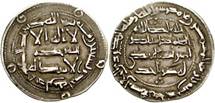
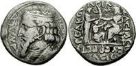
below, we see that the text and icons co-mingle in spaces influenced by
one another, rather than by rectangles.
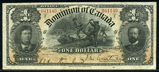
Figure
14 - One dollar banknote, Canada, (1898) [25].
 |
 |
 |
Veiled
and diademed head of Concordia right, PAVLLVS LEPIDVS CONCORDIA around
L. Aemilius Paullus standing to right of trophy, Perseus and his two
sons captives on the left [26].
|
Central
Arabic legends surrounded by Arabic legends; outer frame with five
annulets. Islamin Dynasties. Omayyads of Spain. Al-Hakim. 796-822 AD
[27]. |
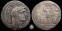
Coin of the Parthian
king Artabanus II (circa 126 BC) [28]. |
Figure
15– various coins demonstrating non-rectilinear layout
Coats
of Aarms
 |
 |
 |
| Scan einer
Couleurkarte des Corps Marchia Brünn [29]. |
Escudo Municipio
Scure -Zulia – Venezuela [30]. |
Studentenwappen des
Corps Budissa Leipzig zu Passau [31]. |
Figure
16 – various Coats of Arms displaying non-rectilinear layouts
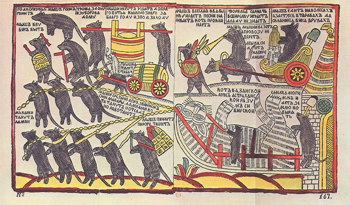
Cartoons
Figure
17 - "'The Mice are Bburying the Cat,', a 1760s Russian lubok
hand-coloured woodcut. It probably originally dates from the reign of
Peter the Great, but this impression probably dates from c. 1766; p.
Possibly a satire on Peter's reforms, or just a representation of
carnivalesque inversion, 'turning the world upside down'. [32]"
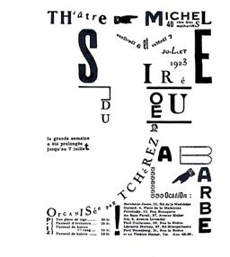
Popular
Culture
The
era of “poster art” in the United States, particularly for the
“psychedelic genre” was well known for its fanciful nonlinearity. Three
rather prototypical examples are shown here. Note how the distinction
between text and graphic is particularly blurred in these, as was quite
typical of the genre.
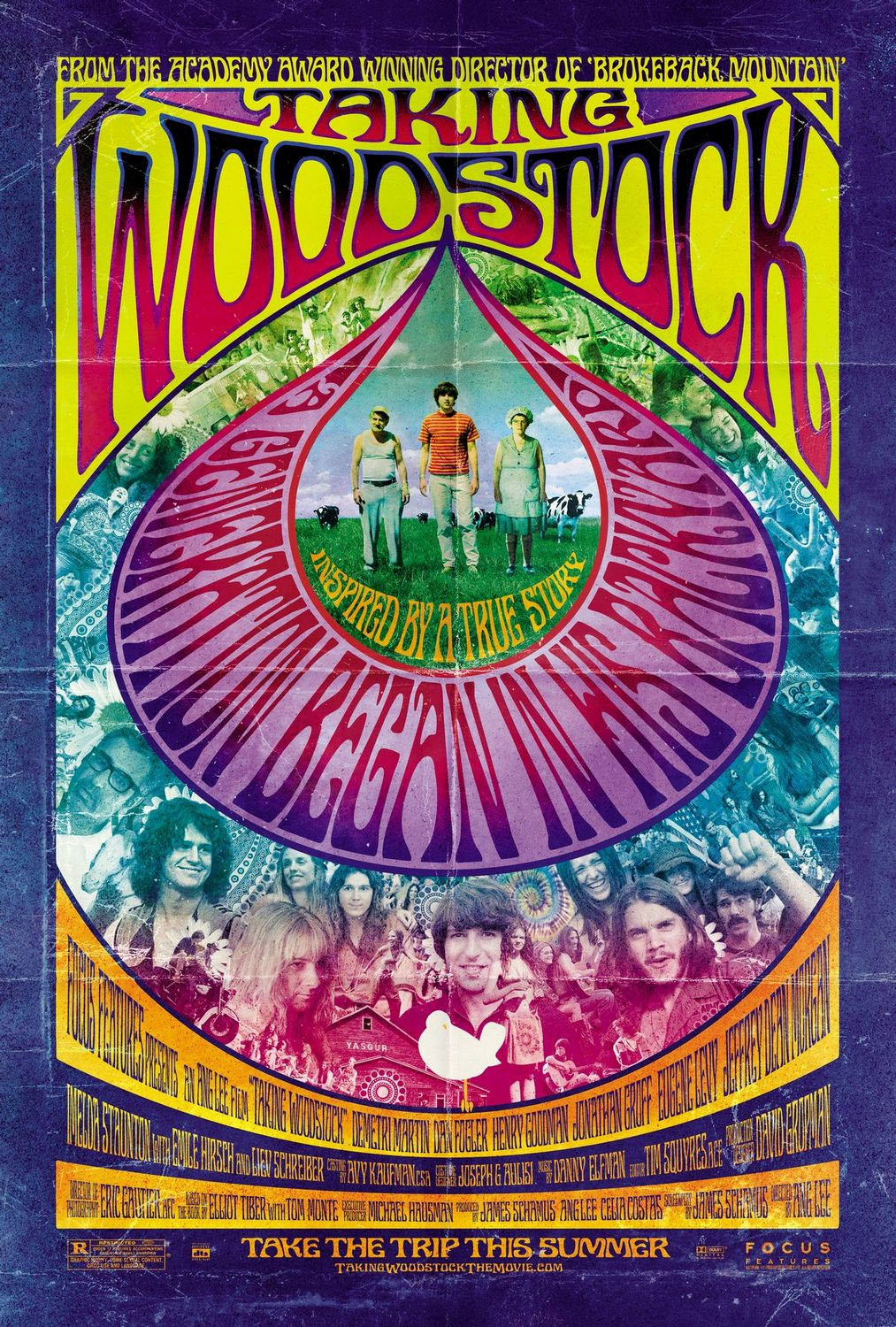 |
 |
 |
| Taking Woodstock
poster [62] |
Jefferson Airplane
at the Fillmore [63] |
Grateful Dead, Otis
Rush, Canned Heat [64] |
Figure
18 - various posters advertising bands and music concerts
The
same tendency can be seen in the album covers of, not only that period,
but later as well. A symbiosis between the advertising of concerts and
that of the live performances seemed to exist. Again, it is not only
text, but other meaningful elements that can leverage the freedom of
layouts not based on rectangles. We view this sort of arrangement of
meaningful elements as somewhat, but not completely, differentiable
from the standard rules of aesthetics which tended to govern the
balance and composition of Renaissance painting.
 |
 |
 |
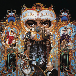
| album cover: Michael
Jackson's Dangerous
(1991) [33] |
detail
of left
picture [33] |
album
cover:
Beatles' Revolver
[34] |
Figure
19 – album covers of various artists
Software
Visualization
and Flow Charts
Since
the early days of attempting to visualize the interconnections of
complex entities like software, various shapes such as diamonds have
been used to represent semantics. However, what is most relevant to the
signification of the geometry is not the choice of how the nodes or
leaves are portrayed, but the nature of the spatial connections between
those nodes. Certain diagrams, as argued later, simply do not lend
themselves to rectangles, but require more flexible partitions of the
space the artist has to work in.
Figure
20 – A Guide to Navigating NPR’s Top 100 Science Fiction and Fantasy
Books [35].
Figure
21 – UK Energy Flow Chart [36].
 Figure
22 - Euler diagrams - Dwyer (2012) [37].
Figure
22 - Euler diagrams - Dwyer (2012) [37].
In
the last example, we are given an instance of how certain researchers
at Microsoft Corporation have been using Euler diagrams, rather than
the conventional flowchart to help visualize interrelations between
parts of complex software projects. This particular example is applied
to a Shakespearean play, illustrating the breadth of applicability of
such approaches as well as the spatial complexity needed in order to
present these interrelations.
Mind
Mapping and Thought
Mapping
In
the last part of the 20th century, a certain way of presenting the
interrelations between concepts became popularized: “mind maps.” While
such a technique is claimed to have examples dating back to Leonardo da
Vinci and to the much earlier Porphyry of Tyros, 3rd century BC [38],
the concept definitely shows popularization following the revolution in
cognitive science emanating from work of Alan Collins, M. Ross
Quillian, Marvin Minsky, Donald Norman, and others who used semantic
networks to describe and mimic the human learning process during the
late 1960’s and 1970’s. A British popular psychologist Tony Buzan seems
to be the first to use the actual term in 1974. The popularization of
the concept of the hypertext, and software that allowed the creation of
hypertexts in the 1980’s, such as Jay David Bolter’s Storyspace, and Apple
Computer’s HyperCard, certainly served to put that
sort of thinking into the collective zeitgeist.
 Figure
23 - Mind Map (circa 2012) [39].
Figure
23 - Mind Map (circa 2012) [39].
That
others had experimented with such concepts is apparent from this
diagram drawn in a notebook in 1972. It is an experiment in which the
author played with thought-mapping rather than mind-mapping, and it was
around that time that my fascination with the topology and graph theory
of ideas came into being.
 Figure
24 - Thought map: Experiment in Writing (1972) [40].
Figure
24 - Thought map: Experiment in Writing (1972) [40].
Maps
Maps
have always attempted to marry semantics with geometry in the effort of
fitting symbols, words, and pictures into a geometry that bears some
resemblance to a particular theory of the shape of the world. Over
time, the theory of that shape may change and certainly the concepts of
which are the most important aspects of social and economic
infrastructure will change. Contemporary attempts to project the
earth’s spherical surface onto planar drawings that minimize Euclidean
distortion have undergone continued re-evaluation through
experimentation and theoretical advances. Certainly however, the
development of the cartogram (see
http://en.wikipedia.org/wiki/Cartogram
for more information) in which
the Euclidean
correspondences between latitude and longitude of places with their
placement is made secondary to other variables, such as population
density, have challenged contemporary notions of what matters most in
mapping. That words, symbols, and pictures flow into non-rectangular
shapes has been a persistent hallmark of the map as a communicative
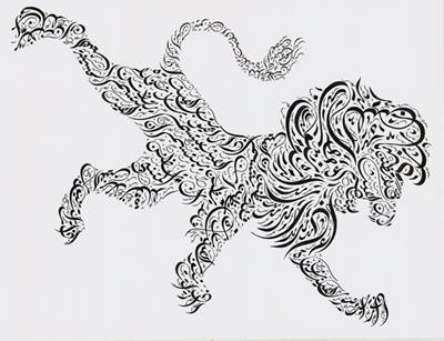
device. That the world should be drawn as a circle, or that a country
should be shaped like a lion, or that departures from Euclidean realism
should be minimized, are all theories of space that affect how labels
and symbols for things and their meanings should flow together in our
maps. The Mappa Mundi of the European Middle Ages frequently reflected
a belief that the world was intrinsically circular, perhaps with
Jerusalem at the center and heaven at the top, and that the proximities
between physical places on the earth might be less important than
spiritual distances.
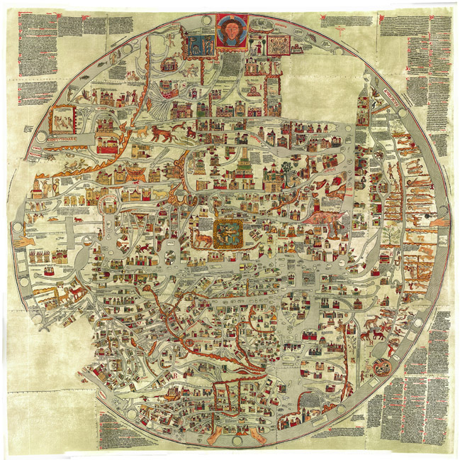 |
 |
| Eberstorfer Stitch
(ca. 1300) |
Detail of
Eberstorfer Stitch |
| Figure
25 - Above are examples of Mappa Mundi. The specific Eberstorfer map
"was attributed to Gervase of Tilbury at around 1234 for some time;
newer comparisons date the original image into the year 1300 and no
longer to that person. [41]." |
By
the time of the Renaissance, perhaps in part due to the discovery of
the “New World” and circumnavigation of the earth, an insistence on
correlating map distances with terrestrial distances seems to have
become the norm. That a person should be able to put a ruler on a map
and use that distance to estimate city to city travel times seemed to
be a part of this exploration-conscious era.
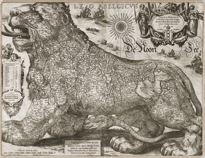 |
 |
| Figure 26 – (left) the Netherlandic
Lion, a
popular design of the countries Netherlands, Luxembourg, and Belgium
and (right) detail [42]. |
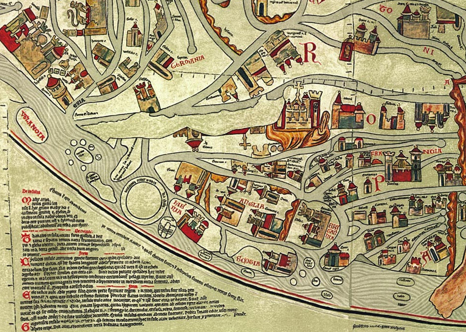
By
the time of pre-Haussmannian Paris, discussed in greater detail in a
later section, and with the advances of engraving, maps had become
highly realistic in the geometric sense of correlated distances. The
symbologies of text, buildings, roads, rivers, and even gardens had
grown into the quite expressive language of what most now recognize as
modern cartography.
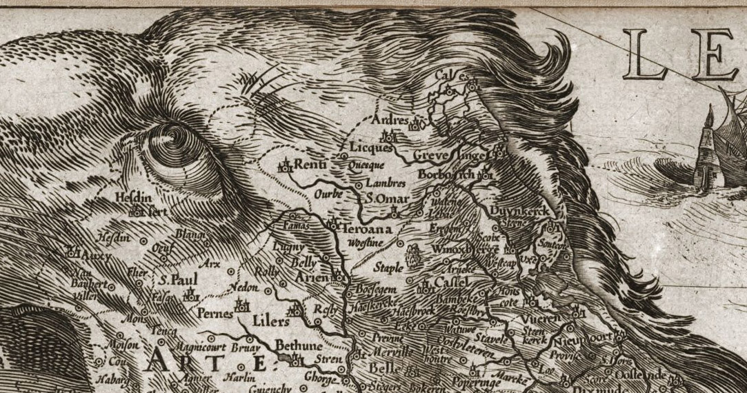
The map below by Louis
Brion de la Tour is described thusly:
An
extraordinary map of pre-Haussmann pre-Revolutionary Paris and the
early Faubourgs (suburbs) issued in 1780, during the final decade of
the French Monarchy. Covers Paris on Both sides of the Seine from the
Ecole Militaire to the Hôpital de la Roquette, extends
north
as
far as Montmartre and south roughly to Les Gobelins. Produced at the
height of French dominance of the cartographic arts, this map is a
masterpiece of the engraver's art. Individual buildings, fields,
streets, hills, valleys, orchards, and public gardens are revealed in
breathtaking detail. We can even see the incomplete state of the
northern wing of the Louvre Palace. There is an elaborate street index
on either side of the map. An allegorical, neoclassical title cartouche
featuring war trophies appears in the upper right quadrant. This type
of map, known as a pocket or case map, is designed with the traveler in
mind, and while it displays beautifully unfolded, is designed to fold
and fit in a vest or coat pocket. It accordance with its purpose the
map has been dissected and mounted on linen in 24 sections. This system
was devised in the 18th century to protect folding maps against damage
caused by repeated folding and unfolding. The linen backing absorbs the
stress of folding and can easily be mended or replaced, thus preserving
the integrity of the actual paper document. Folded this map fits into a
beautiful brown tooled leather slip case, which is included [
43].
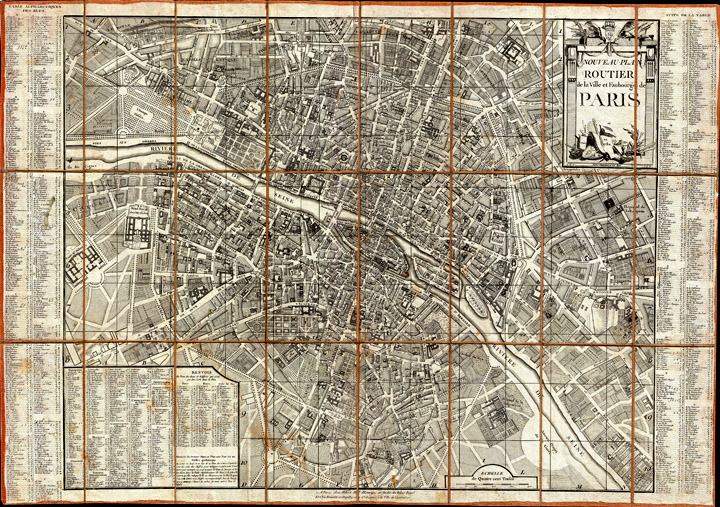 |
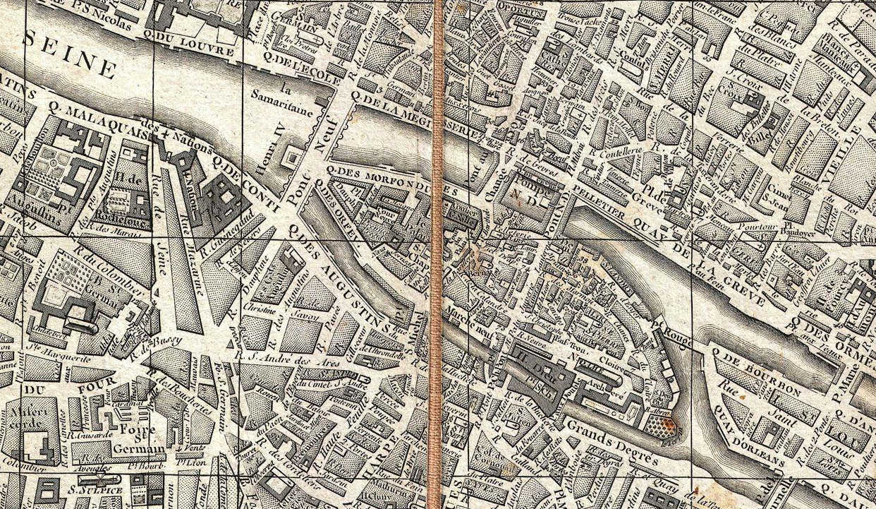 |
| Figure
27 – (left) Map of Paris from 1787, designed par Louis Brion de la Tour
and (right) detail [46]. |
That
the semantic elements of a map are bound to regions other than
rectangles, is so obvious that many of the architects of the modern web
seem to frequently neglect this most obvious of use cases for
non-rectangular flow. Not only do words conform to their containers,
streets, rivers, and parks, but the semantic elements marking buildings
and the like expand to fit the geometry of their surround in a fashion
dictated more by semantics than by photorealism.
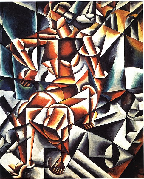
Art
(Plain and Simple)
The
fact that the world’s art does not flow into rectangles is just as
self-evident as the case with maps. What might not be apparent at first
glance is just now much of world art has relied on the flow of
meaningful symbols into artistic divisions of space. We present several
examples without explanation, just to illustrate, once more, the basic
premise that rectangles are not always the best containers for our
human ideas.
 |
 |
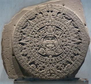
| Figure 28 – (left) Monolith rock of
the sun and (right) detail [44]. |
 |
 |
| Figure
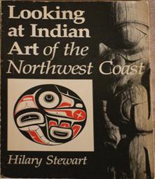
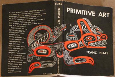
29 - (left) Book Jacket: "Looking at Indian Art of the Northwest Coast"
[45], (right) Book Jacket:
"Primitive Art" [46]. |
Figure
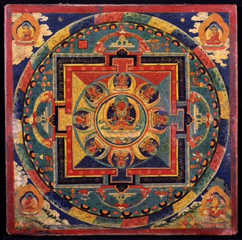
30 - Amitayus Mandala [47].
 Figure
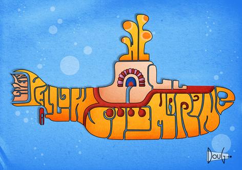
31 - Yellow Submarine -- derivative art [48].
Figure
31 - Yellow Submarine -- derivative art [48].
 |
 |
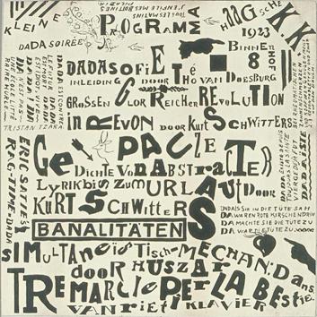
| Figure 32 - (left) kleine Dada Soir
Theo van Doesburg, Poster Kleine
Dadasoirée Haagsche K.K. [proof], December 1922 - 10 January 1923,
Lithography [49].
(right) Evening of the Bearded Heart,
Zdanevich (1923) [50]. |
 |
 |
 |
| Air Man Space [51] |
The Aficionado [52] |
The(a)mes: Market [53] |
Figure
33 - Cubism as meaningful (non-rectilinear) vectors
The
Web and Rectangles
While
many
forms of expression, both historical, modern, and across many cultures,
have
flowed into shapes that are numerous and non-rectangular, it is
certainly the
case that the printing press, with its primary emphasis on text and
secondary
emphasis on graphics, serving as auxiliary
illustration, relied on the rectangle for typesetting. When graphics
were sprinkled
in to text, rectangles to contain them were set aside, for the ease of
aligning
parallel lines of typed characters.
Likewise,
a few centuries later, as
the hypertext came into
being (see http://en.wikipedia.org/wiki/Ted_Nelson)
the computer and the internet were the natural media for delivery. The confluence of
programming ease and the
historical conventions of printing, made the CSS box model a natural,
albeit
stifling, choice for expressive convention. It was particularly
believed, in
the conventional model of the web, that the following three things were
all
distinct, separable, and orthogonal, and that their separation, like
cats, dogs,
and humans, was somehow predetermined, almost as if by a higher being:
- Semantics
- Presentation
- Behavior
Had
HTML, containing a very dominant T as its second letter, been the only
way to offer human expression on the wondrous medium known as the Web,
then the world might have been content to presume that this trichotomy
was, in fact, valid. Alas, for the conventionalists, SVG gained
traction and the distinction between these three inviolable domains
becomes blurred, at best. Briefly, the three aspects of the meaning,
form, and behavior of expressions are sometimes inextricably
intertwined, not only in the ongoing progress of human expression, but
SVG happens to allow those expressions to occur in ways which better
preserve, for the sake of various kinds of accessibility, all three.
Rectangles
as containers of content have been perpetuated on the web out of simple
conformity with historic traditions of the printing press, out of the
fact that it is easier to write programs to flow text and graphics into
rectangles, and out of the simplified, albeit flawed, notion
that
presentation and content may easily be separated. It sort of worked
with HTML. It most certainly does not work for more general expressive
content.
Interestingly, Ted
Nelson, the creator of the term “hypertext” has also written:
"Hierarchical
and sequential structures, especially popular since Gutenberg, are
usually forced and artificial. Intertwingularity is not generally
acknowledged—people keep pretending they can make things hierarchical,
categorizable, and sequential when they can't [
54]."
From
a mathematical perspective, there is no reason to presume that all
ideas can be expressed within two dimensions, let alone three. Our
physical world is intuitively three-dimensional, with movements in
those three dimensions over time, presenting richness that is hard to
convey in a static canvas, even if that canvas is three dimensional.
Indeed, the mere concept of five things mutually interconnected, known
in graph theory as K5, the complete graph on five nodes, cannot be
diagrammed, without overlapping edges in two dimensions per
Kuratowski’s Theorem [55]. In
contrast, four mutually connected
entities and their connections can be drawn in two dimensions, though
there is no way to draw such a relation if all of the regions to be
connected are rectangles (for illustration see http://cs.sru.edu/~ddailey/NonRectangles/Rectangles.html).
If
we consider that the reason for placing things near one another in
space has to do with semantic proximity (with maps this seems a
reasonable constraint for expressions to be understandable), then
semantic necessity sometimes dictates that things should not be
rectilinear (That the topology of ideas is relevant as an intrinsic
part of their visual representation is given support in this article by
Steven
Pinker: http://pinker.wjh.harvard.edu/articles/papers/Pinker%20A%20Theory%20of%20Graph%20Comprehension.pdf)
Paris
In
the mid-19th century Napoleon III presented Georges-Eugène Haussmann
the opportunity to redesign Paris. Haussmann transformed it from a
medieval city with poverty, poor drainage and sewage systems, and a
well-known predisposition to revolutions, into a modern city with wide
boulevards connecting its monuments and facilitating transportation
along both avenue and train (as
the Paris revolt of 1871 demonstrated (cf. http://en.wikipedia.org/wiki/Paris_Commune),
the Parisian fondness for revolutions was not ended by Haussmann’s
redesign
efforts).
The familiar appearance of a city that
now greets film-makers and tourists alike was forever changed by
Haussmann’s enormous undertaking in urban planning. The transformation
was so sweeping (and costly) that historians refer to Paris as either
pre-Haussmannian or post-Haussmannian. Haussmann no doubt took
some of his inspiration from Pope Sixtus V’s redesign of Rome three
centuries earlier. That plan, though less far-reaching, likewise
consisted of the construction of several straight linear avenues cut
through medieval neighborhoods previously composed of winding narrow
passageways that circumnavigated historic tracts of real-estate,
occupied by buildings that had crumbled and been rebuilt uncountable
times on the same footprints over the centuries.
J. C. Moughtin,
Professor Emeritus of Planning, writes:
"The
straight street is associated with axial city planning in addition to
gridiron planning. Two outstanding examples of axial planning are Rome,
as laid out by Sixtus V, and Paris, as planning by Haussmann
for
Napoleon III. Sixtus V was concerned to develop a structure
of
paths along which pilgrims could move freely from church to church. The
great processional routes established by Sixtus V set the pattern for
much later architectural development and heritage which remains today.
Haussmann, too, was concerned with movement, but in this case it was a
concern for the rapid movement of troops to keep order in the city. The
plans Haussmann prepared have also left a great heritage of city street
design [
56]."
 |
 |
| Detail of Street Map
of Paris [57] |
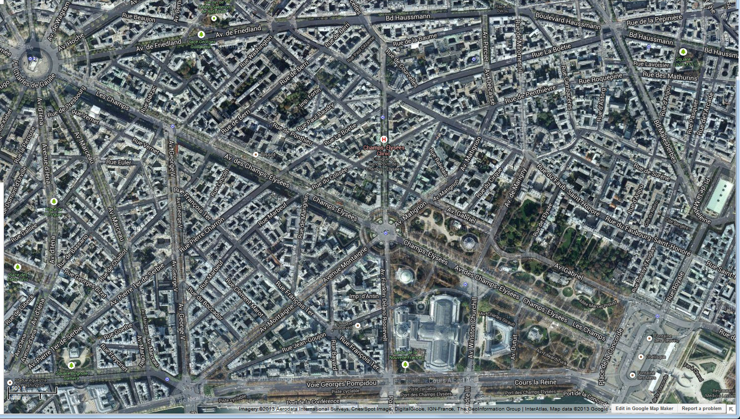
Google Maps section
of Paris [58] |
Figure
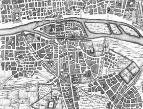
34 - Paris: (left) pre-Haussmann and (right) post-Haussmann, showing
how the nature of its lines changed.
Controlling
Geometry
Haussmann’s
redesign of Paris had several objectives: improvement of traffic,
reduction of squalor and disease, creation of public parks, and
improvement of infrastructure such as sewage and aqueducts [56]. At the
same time, the redesign allowed better municipal access by police and
maintenance workers. Many argued that it made the task of preventing
revolutions easier, by making it harder for crowds to erect barricades,
and easier for the armies to fire artillery without risk to property or
harm from friendly fire. Both Haussmann’s and Sixtus V’s forays into
urban planning can be seen as attempts to bring control to an otherwise
unruly situation.
It
was in Paris, in 2010, while attending a workshop on the control of
font families through collections of parallel lines, when I was struck
by how the tyranny of the rectangle controlled not just layout, but
even those glyphs that authors of texts cast into those
rectangles. Paris, with its non-rectilinear layout, seemed
just
the right metaphor. That premise has been a central
hypothesis
of this work.
While
a user interface for controlling rectangles can be provided by “table
wizards” which before the ascendancy of CSS, were an essential tool for
controlling web layout, perhaps some other interface could be designed
which would allow the easy control and manipulation of lines that might
control both layout and typographic design! In particular, it was
realized, a large set of lines may be controlled by a small set of the
circles to which those lines are tangent.
Ways
of Controlling Lines (Tangents to Circle)
Table
wizards, implemented by companies such as Allaire, Microsoft, SAS,
Adobe, and Macromedia, have been used since as early as 1995 to control
the layout of rectangles supported in the web, using HTML
<table>
or CSS. They provide a GUI that simplifies the partition of the browser
window into a flexibly defined set of rectangles. It is natural to ask
if this functionality is somehow intrinsic to rectangles; merely
convention, based on centuries of practice with printing, or ease of
programming that has kept CSS, and hence the web, locked in these
barely post-medieval rectangles.
Table wizards gave authors a simplified GUI for the control of
rectangular web geometry, writing the somewhat difficult rowspan and colspan
attributes in the HTML table code for us. As the “tyranny of
the
rectangle” has ingrained itself both in standards and thence in
people’s thinking, it is not clear that the functionality of the HTML
table as a layout convenience has yet been matched by the zealously
ideological CSS, though I have heard rumors that it has been, if one is
willing to obtain an advanced degree in CSS.
| The appearance |
The HTML |
 |
<table
border="1" cellpadding="2" cellspacing="2">
<tr>
<td></td>
<td></td>
<td
rowspan="3"></td>
<td
rowspan="2"></td>
</tr>
<tr>
<td
colspan="2"></td>
</tr>
<tr>
<td
rowspan="3"></td>
<td></td>
<td></td>
</tr>
<tr>
<td
colspan="3"></td>
</tr>
<tr>
</tr>
</table> |
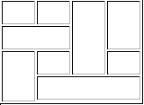
Figure
35 - A complex partition of a rectangle using colspan and rowspan.
Most
modern software seems to enable complex rectangular partitions through
the slightly more tedious splitting and merging of cells, which while
manageable, is not quite so convenient for the more complex designs!
However
a simplified GUI that allows flexible partition of space into polygons
might also be had from the use of either Voronoi diagrams or line
arrangements.
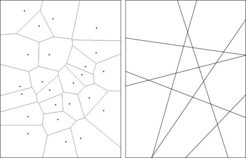 Figure
36 – Voronoi Diagrams (left) and line arrangements (right)
Figure
36 – Voronoi Diagrams (left) and line arrangements (right)
Either
could be seen as potentially valid partitions of the plane, perhaps
appropriate in slightly different contexts. The natural
interface
for producing Voronoi diagrams is given by their definition: a set of n
polygons corresponding to a given set of n nodes such that, every point
interior to a given polygon is closest, in Euclidean distance, to the
node corresponding to its polygon [59]
(the interface arising naturally from this, using SVG, JavaScript, and
D3 may be seen at http://cs.sru.edu/~ddailey/voronoi.html).
To
generate the a
maximum of n(n+1)/2 +1 polygons
associated with n lines, one merely needs to provide 2n
actions, given as mouse clicks at two locations, to specify the n
lines, however even more efficiency of interface to output may be
realized from the following remarks about the lines tangent to a set of
circles.
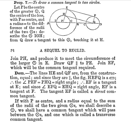
Historical
Construction of Tangent Lines
Euclid’s Proposition
17 of Book III of The
Elements
constructively proves that given a circle and a point outside that
circle there are two lines tangent to the circle that pass through the
point [60]. It is likely that
Archimedes and his students were aware of
a method for constructing lines tangent to both of two circles, since
one of Archimedes' students, Apollonius, resolved the issue of how to
construct the eight circles tangent to each of three given
circles. The technique is demonstrated in the 1888 work of
John
Casey [61].
Figure
37 – An excerpt from the work of John Casey [61].
Likewise,
in the case that the two circles are disjoint, the other three tangent
lines may be similarly constructed. In the software we describe in this
paper, called Tansy (from its use of tangents to pairs of circles), we
call the two circles formed about the point P with radii,
respectively r1=radius(AEB)-radius(CDF)
and r2=radius(AEB)+radius(CDF),
“ephemera” and allow the display of many of these ephemera within the
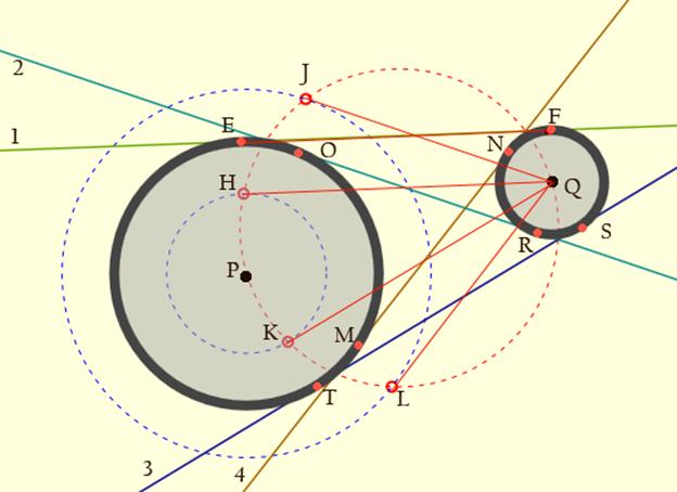
software. The construction proceeds as follows:
Figure
38 – Screenshot from Tansy, described in detail below.
The circle PLQ
(red) is constructed centered at the midpoint of PQ and passing
through both P
and Q.
Points H, J, K and L
are constructed where the “difference circles” (blue) and the red
circle meet (solving the two simultaneous quadratics for the
intersections of two circles). The segments QH, QJ, QK, and QL are
constructed. Next:
(1)
EF,
parallel to QH,
is constructed at a distance r1
from QH.
It forms a segment from which the line 1 is constructed.
(2) OR,
parallel to QJ,
is constructed at a distance r1
from QJ.
It forms a segment from which the line 2 is constructed.
(3) TS,
parallel to QK,
is constructed at a distance r1
from QK.
It forms a segment from which the line 3 is constructed.
(4) NM,
parallel to QL,
is constructed at a distance r1
from QL.
It forms a segment from which line 4 is constructed.
The
line segments, once constructed, are then extended until each meets the
bounding box of the screen’s edge. Additionally, the interior lines,
those crossing one another between the two circles to which they are
tangent, are stored within the program in an array called “Inner,” and
the exterior tangents are called “Outer.” These two classes of lines
may be hidden or made visible as per the user’s choice.
Moving
Lines
During
the early phases of our project we had created an interface that
allowed lines to be drawn, free of the circles. In this simplified
interface, each line was drawn with a mouse down event at (x1, y1) and
a mouse up event at (x2, y2). The line segment, thus constructed, was
extended as a line, until it met the edges of the screen.
Furthermore, lines could be dragged by selecting any point on the
initial segment. Each of the endpoints also was used as a pivot point,
such that the line could be rotated about that point by selecting a
segment between the pivot points and the screen’s edges. Currently when
the user exits the “circles mode,” the initial circles are hidden and
the lines are thickened so as to allow the selection of a line by a
mouse down event. Once selected, the line may be rotated. In a future
improvement, we seek to recreate the previous interface by creating a
pair of natural pivot points, probably based on the circles that
defined the line originally.
Finding
Intersections and Segments
Determining the place
where two lines meet is trivial, since the equations of both lines are
known. We calculate the n(n-1)/2
intersections of the n
lines, taking care not to when two lines are parallel, using doubly
nested loops. It is important to realize that the lines, are labeled
(and hence remembered) in the order in which they were drawn. This is
not an order that presents any geometric intuition
about whether a line’s intersection with another line, will lie to the
left of or the right of, for example, its intersection with a third
line. The ID’s of the lines contain information, merely about when the
line was drawn, not where the line is located. The
implication
for this is that knowing, for example, in the illustration below, that
the points (4, 7) and (6, 7) form a line segment while (4, 7) and (5,
7) do not, requires more computational logic than might, at first
glance, be obvious. It is the process of determining the connectivity
or adjacency of the intersection points of one chosen line with two
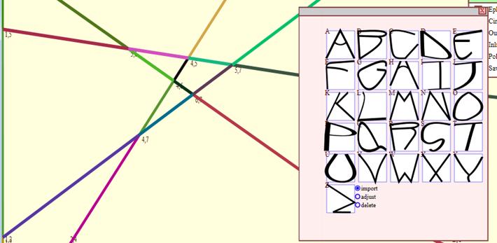
others that is the meat of this particular process.
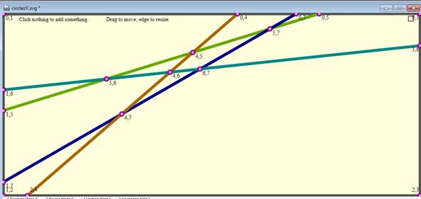
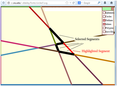
Figure
39 – Screenshot from Tansy after exiting “circles mode” showing
intersecting lines and the segments formed.
The
collection of all line segments is found by taking the union of all
lines, including the four lines on the edge, into an array called
“Relevant.” Either Inlines or Outlines may be excluded from
consideration. Each line in Relevant is then investigated sequentially
by function "linearOrder()." "linearOrder()" takes each line it is
passed and forms a collection of all points at which that line
intersects all others in Relevant, so long as those intersection points
fall within the boundary of the screen. It also orders those points
from left to right, by merely sorting a line’s intersection points on
the x-variable, assuming that no line is perfectly vertical. As a
result, the line’s points of intersection are then collated in a proper
sequence. A line’s segments may then be identified by merely
grouping pairs of consecutive points.
Once
the user clicks on either “Segments” or “Polygons” a complete list of
all line segments is provided to the program for later purposes.
Segments
as Drawing Elements
Our
treatment of line segments has relied on the basic premise that a
collection of line segments is not merely a drawing, but an infinite
collection of potential drawings. We may conceptualize a basic shape
generated by a collection of line segments as a glyph, known also as
characters or sprites, which may ultimately be reshaped by adjusting
the underlying geometry of the original line arrangement. That is, line
segments that are collinear should remain collinear even as the
geometry of a scene is modified. Likewise, the preservation of relative
orientation, such as the notion that the curve of the letter P
should remain in similar proximity to the upright of the letter,
regardless of the stretching or deformation of the glyph is intrinsic
to our design of this part of the program. Specifically, we seek to
define not just a drawing but a class of drawings in which
relationships between elements are defined by an underlying geometry.
In the World Wide Web of the future, users should be able to tweak not
merely individual characters within a font family, but to apply, with a
shared and simple interface, global modifications to the entire
collection of glyphs within the family. One should be able to define
not merely, a set of states through which a shape, like a sprite,
transforms over time, but the ways in which that shape conforms to its
surround and to the other shapes around it.
The Selection of a Collection
of Line Segments
Once
the segments of a line have been identified, as described earlier, they
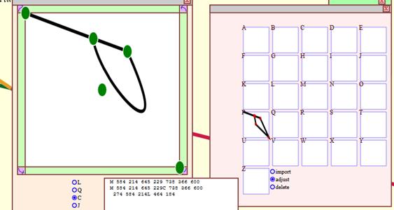
may be displayed by toggling the “segments” check box. One
can
then select any of the highlighted line segments; they turn red on
mouse over events and black when clicked. If a black, selected, line is
clicked a second time it is deselected and its color returns to its
original randomized value .
Also,
as the number of line segments along a given line can be large, the
program allows that if two non-contiguous segments along the same line
are chosen directly after one another, then all segments between those
two are also selected.
Figure
40 – Screenshot from Tansy showing selected line segments, this is
the beginning part of glyph formation.
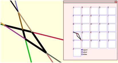
Sets
of Segments as Glyphs
The
glyph editing part of Tansy is quite the fledgling at present,
but it displays an example of the sort of functionality we expect it to
have.
Once
a collection of segments has been selected, then the user may store
that collection as a glyph by clicking “save” and then the appropriate
letter of the alphabet, currently just the 26 characters of the Roman
alphabet are supported. Additional shapes may then be selected and
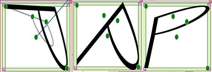
stored. Each shape is transformed, through rescale and
translation, so as to fit exactly into the bounding box reserved for it
by that character of the alphabet.
At any time, after a
collection of segments has been saved as a glyph, the glyph may be
edited, by opening the glyph editor.
Figure
41 – Screenshot from Tansy showing the Glyph editor
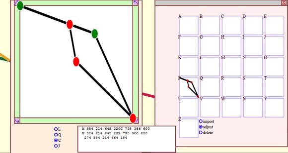
By
choosing the “adjust” mode, any glyph can then be opened so that its
control points, the end points of its line segments, may then be
modified. The following conversion types are currently
supported;
linear to quadratic, cubic, or join. Join allows the path
resulting from the glyph to retain the control points given by the
underlying line arrangement, but the nature of how the glyph responds
to those control points is then modifiable.
Figure
42 – Screenshot from Tansy showing the adjustment of a glyph
before adjustment
For
example, in the above glyph, we will modify the “tip of the P” – the
bottom rightmost control point modifying it from linear to cubic.
Figure
43 – Screenshot from Tansy showing the adjustment of a glyph
after adjustment
Finally,
the glyph may be rotated and “bloat wrapped” so that the glyph, even as
reshaped by the change in status of the nature of its control points
(from, for example, linear to cubic), still fits the bounding box
reserved for it:
 Figure
44 – Screenshot from Tansy showing the adjustment of a glyph
after all adjustments
Figure
44 – Screenshot from Tansy showing the adjustment of a glyph
after all adjustments
To
demonstrate that this technique can indeed work for defining an entire
font-family, which could then, in theory, be reshaped in numerous ways
by redefining the underlying geometry, following is an illustration of
the drawing, completed in less than 10 minutes of 26 letters, using
merely four control lines. Clearly, a font family drawn with more
control lines could have greater expressive nuance associated with it.
 Figure
45 – Screenshot from Tansy showing a completed font family using
just four control lines
Figure
45 – Screenshot from Tansy showing a completed font family using
just four control lines
Finding
Polygons
As described above it requires a bit of
computational work to find the
adjacencies (or linear ordering) among the intersections of a line with
other
lines.
Likewise, discovering the polygons created by a line arrangement is not
as easy as it might seem, at first glance. In both cases, the massively
parallel architecture of the human visual system makes both tasks seem
trivial.
The
polygons are clearly composed of the line segments found as described
earlier. These segments are stored as a large array, called
"SG,"
later processed by function "polyFind()" which finds the
polygons. The function starts by moving along a line until it
finds an intersection, easily found because all of the segments start
and end at intersections. At the end intersection, all four
segments leading from that intersection are “oriented”, meaning that
their angles (from zero to 360 degrees) are evaluated so that we may
choose to take either a right turn (if one exists) or a left
turn. This clockwise (or counterclockwise) traversal is
continued
until the sequence of right (or left) turns leads back to the start
node. At that time, a loop has been traversed and a convex polygon has
been located. The polygon is then stashed atop an array.
This
approach is successful in that it finds all polygons created by the
combination of visible tangential lines. It does require an
adjustment since each n-sided
polygon is found as many as 2n
times, twice for each of its vertices, since the polygon may be
traversed beginning at any of its vertices and may be traversed either
clockwise or counter-clockwise from each. Each duplicate
polygon
must then be identified and not rendered.
Recognizing
When Two Polygons are the Same
For each n-sided polygon on
the screen there are up to
2n
different versions of the polygon found, so a process to isolate only
one instance of each polygon must be employed.
 Figure
46 - Above image shows one six-sided polygon. This polygon is
initially found six times, once for each vertex.
Figure
46 - Above image shows one six-sided polygon. This polygon is
initially found six times, once for each vertex.
There
are two methods that are used for reduction of polygons: canonical and
sort.
The function canonical does most of the work in
removing
the repeated polygons.
function
canonical rotates each polygon until
it
begins with the lowest node index. Once all of the polygons
begin
with the lowest node index they may be compared with the other n-sided
polygons. Most of the duplicate polygons are discovered
within
this method. The polygons are then run through a JavaScript
built
in sort to ensure they are in the correct order, doing this ensures
that canonical worked correctly and that anything missed by canonical
is correctly indexed. When running canonical alone the
polygons
on the outer edge of the screen were each rendering twice so the use of
sort was added to the preexisting code in order to make up for
this. At this point each proposed polygon can be compared,
and
only unique polygons are created.
Filling
Polygons with Color, Gradients, or Imagery
Once
the polygons are found, they then can be filled with
content.
In breaking the rectilinear mold the eventual goal would be to support
all of the
features currently supported by HTML in order to create a viable
replacement to the box model. In that sense we need to be
able to
fill a polygon with color, images, text, and
hypertext. Text will be
covered
in the next section of this document.
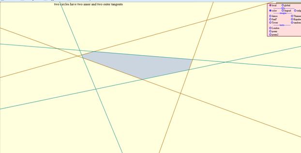
There
are two ways to fill a polygon with imagery: "global" and "local." In local fill, the
image is resized to match the size of the bounding box
of
the polygon. The image is then clipped so that only the
portion
within the polygon is shown.
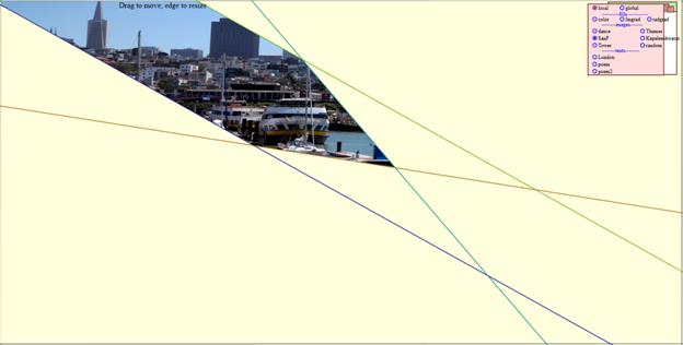
Figure
47- An image of San Francisco using local fill
Global fill mode
sets the size of the image equal to the size of the
screen and then only displays the portions of the image that the user
selects.
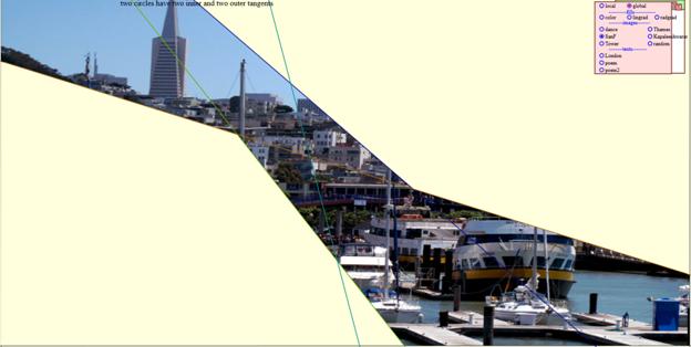 Figure
48 - An image of San Francisco using global fill. Notice that
an
almost identical portion of the image is shown using multiple polygons
as Figure 40 is shown using a single polygon.
Figure
48 - An image of San Francisco using global fill. Notice that
an
almost identical portion of the image is shown using multiple polygons
as Figure 40 is shown using a single polygon.
There are also three
different sources from which Tansy allows the user to choose an image:
- Canned
images stored on our web server at SRU
- URL's
pointing to images on the web
- Files
accessed from the user's local hard drive.
Implementing
the last of these techniques was the trickiest, since the new file
upload mechanisms of HTML5 allow for dynmic access to local drive space
through window.URL.createObjectURL(
) using code including these lines:
	var img = document.createElement("img");
	img.src = window.URL.createObjectURL(files[0]);
	IS.setAttributeNS(xlink,"xlink:href",img.src)
Allowing
these locally served images to be included in the user's saved work,
given the lack of availability of the full path name, requires that the
user's images must be saved in a predefined directory (currently,
the same directory into which Tansy's output will be saved).
Similar
to the way that images can be flowed into single and multiple regions,
so too, can color and gradients be flowed into the same regions.
Since the polygons have been discovered and rendered as SVG paths,
filling with color or gradient is trivial. Currently, we use random
colors and random gradients, though a color picker and a gradient
designer would be nice future additions.
Filling
Polygons with Text
Currently
there is no <textarea> contained within the SVG
specification. (Two companies decided not to implement the
SVG1.2
standard which had compelled it, opting instead for the watered down
SVG 2.0 that is not yet accepted). This leaves the process of flowing
text into an arbitrary shape to the programmer. This is
accomplished through Tansy's function textFit().
The function takes two parameters: an
SVG path
element
and the text. The path element represents the polygon and
must be
separated into the coordinate pairs that represent the vertices of the
polygon. The d
attribute of the path is parsed and the path is transformed into
coordinate pairs. From there, finding the left and right
edges of the polygon, working downward vertically from the vertex of
lowest value on the y axis, is how the left and right boundaries of the
text flow at a given height can be found.
After
the path is transformed into coordinate pairs the highest point, the
point with the lowest y-value, is found and stored. If two
points
share the lowest y-value the point with the lowest x-value is selected
as the highest. Simultaneously, the lowest point is found,
the
point with the highest y-value, and stored. If two points
share
the highest y-value, the point with the lowest x-value is selected as
the lowest point. After finding these points, the other
points
are sorted into arrays depending on whether they fall to the left or
the right of the highest point, though this is not always correct and
the points are re-sorted into left and right at a later
point.
The lowest point is then added to both of the arrays. At this
point we are able to traverse from the highest point to the lowest
point in two separate directions without repeating any of the
points.
Starting
with the highest point in the polygon and moving through the
coordinates, a set of intermediate points is generated along each line
segment. Then, using the font size of the text, a
series of
points along each line segment is also generated, keeping only the
x-value. This process is repeated until both arrays,
containing
the points left and right of the highest point, are
exhausted.
During the creation of the intermediate points, the x-values are put
into arrays that truly correspond with the left and right side of the
polygon.
Next,
the text needs to be broken down into an array of individual words in
order to facilitate a text wrap feature. We take the two
arrays
of points and create a text object from the left to the
right.
The words are placed into the text object one word at a time.
After each word is placed the bounding box of the text object is
compared to the right coordinate of the intermediate points.
Once
the bounding box is greater than the right point, the text object is
appended to the page. The word that causes the overflow is
returned to the head of the array containing the words. At
this
point, a new text object is generated, using the next left point as its
starting x-value. The starting y-value is calculated using
the
font size. This process is repeated until the array of words
is
empty or there is no more room within the polygon.
Saving
work from Tansy
In order to save one's
work, the
current state of the SVG document, including polygon coordinates,
fills, clipPaths, images (locally stored or remotely served) and the
like, must be serialized. The current version of the SVG DOM, as Tansy
is used to build a page, is maintained internally by the
JavaScript of Tansy. That internal version and the DOM appropriate for
a stand-alone document are slightly different, owing to event handlers,
the way in which the polygons themselves are handled, the
amount
of JavaScript needed in the saved version (clearly less than in the
drawing environment that Tansy provides).
This work is done inside a function , which uses
	var oSerializer = new XMLSerializer();
	var XML = oSerializer.serializeToString(object);
on instances of object
that correspond to several of the drawn layers of the active document:
the Polygon layer, the Images layer, and then adjusts the resulting DOM
to account for considerations such as whether or not Inlines and
Outlines are both visible and the fact that in the current
version's text handling, more tspans are used than would be
desirable for subsequent hand-editing of the resultant SVG.
An example of a "live" webpage,
saved from Tansy and used for the promotion of The Graphical
Web 2014 is illustrated below:
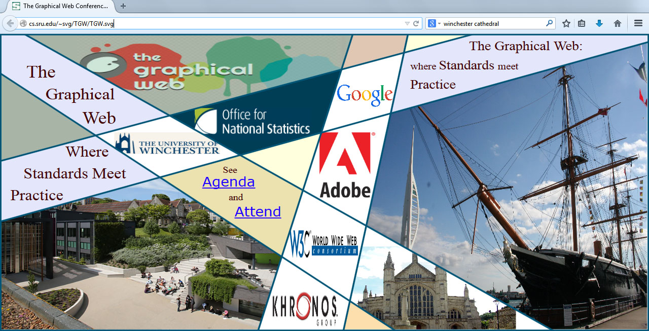
This
page's SVG output required perhaps two hours of tweaking of the
exported SVG code, to get
images properly aligned and to provide working links to other web
content. Other examples (as screen images generated before the export
functionality was added) can be seen here.
The
Current Version of the Software
The
reader is directed to our most current working version of the software
at http://cs.sru.edu/~ddailey/fonts/Tansy1.7.4.htm.
Additionally, however, we are inviting contributions to the project
through github at this address. Brief instructions on how to use the
software can be seen at http://cs.sru.edu/~ddailey/Parisien.html.
It
is also an open source project, currently on Github, so the reader is
also encouraged, invited and urged to contribute. It's a fairly complex
set of routines to handle all the various aspects of geometry and help
is actively sought from those who like geometry, SVG and nonrectilinear
molds!
Future
Directions for Tansy
Several
parts of this project were completed only partially, as a proof of
concept. We hope the reader’s experimentation will provide just the
proof we are hoping for. However, there are some
known
bugs and several things we hope to improve and expand in future
editions of the software:
- Development of a user guide. The current interface is not
intuitive and the user will need help in figuring out what to do. It is
on the agenda!
- Making it
so that as circles (and lines) are relocated, polygons and
glyphs automatically adjust. That is, we wish for the textual and imagery fills
of polygons to
be reflowed, as well as the shape of the glyphs, following the user's
adjustment of the geometry (by moving circles around after the polygons
have been fillled. There are several issues here, including anticipated
speed problems associated with dynamic re-rendering based on mouse
events, and the very thorny issue that as lines move, polygons not only
change shape and size, but sometimes, disappear altogether since one
line might be repositioned to the other side of a particular vertex!
- Improved
text flow. Currently, the lines of text as flowed into
polygons sometimes misrepresent the places where those lines intersect
the left and right edges of some polygons.
Also, owing to oddities with cross-browser handling of how
<tspan>s are measured, each line is currently a
<text> and
each word within the line is a <tspan>. Ultimately, each
polygon
should have only one <text> element, with each new line
being
represented by a single <tspan>. When
serialized, this
adjustment to the SVG DOM is made after the fact, prior to saving the
usesr's work.
- Allowing
for user-defined text to be flowed into polygons. This should not be
too difficult, with some prototypes of the functionality having been
built. One idea would be to create a floating i-frame with dimensions
equivalent to the bounding box of the selected polygon.
- Improved
glyph editor. The glyph editor, allowing redefinition of the
coordinates of a glyph as either linear, quadratic, cubic, or “joined”
(to allow merging of collinear nodes), are slightly buggy and not
intuitive. This part of the project needs to be refactored.
- Importing
of existing fonts. We would like to be able to take an
existing font and have it bloat-wrapped to fit an existing line
arrangement. From there, one would be able to use the controlling
circles to simultaneously modify the entire font family.
- Improved
choice of colors and gradients. Currently, colors and gradients used to
fill polygons are given random colors. Incorporation of a color-picker
as well as a gradient design tool, would reduce the amount of
hand-editing once a document has been exported and saved.
- Improving
the movement of lines. Currently lines may only be rotated
(about one of their control points). Dragging lines as well as allowing
rotation about the other control point should be enabled.
- Deletion
of lines and circles (and corresponding recalculating of
intersections, segments, and polygons).
- Merging
of adjacent polygons. It would be nice to be able to remove the line
segment that separates two polygons so as to merge those two into one
that represents the union of both regions. While this should not be too
difficult to do, it does raise the question of how to flow text into
areas that end up with concavities after such merging, which is
certainly a possibility. I believe the issue of flowing text into
non-convex polygons has not yet been specified by W3C's various working
groups.
- Allowing
for ovals rather than circles to be used. This could prove
useful since when one of the lines of a line arrangement is
moved. It is likely that no pair of circles conform to all
four
tangent lines. Defining the ellipse tangent to four given lines,
appears to
be a complex problem, however.
- Using
github more effectively to stimulate contributes to Tansy from a wider
community.
Works Cited
[1]
Wikipedia, "Composing Stick - Wikipedia,
the free
encyclopeida," [Online]. Available:
http://en.wikipedia.org/wiki/Composing_stick. [Accessed 1 September
2013].
[2]
Wikipedia, "Thoth's
declaration to the Ennead, based on the weighing of the heart of the
scribe Ani".
From http://en.wikipedia.org/wiki/Papyrus_of_Ani. [Accessed August
2014].
[3]
Chi-Rho.
from J. H. Todd, "Descriptive
Remarks on
Illuminations in
Certain Ancient Irish Manuscript," Nichols and Sons, London.
[Accessed August 2014].
[4]
J. Norman, "The
First Combination of
Text and
Illustrations in One Printing Forme (1462-1463) : From Cave
Painting to
the Internet". Available:
http://www.historyofinformation.com/expanded.php?id=2784. [Accessed 1
September 2013].
[5]
Wikipedia, "Page
from the Apocalypse, a block book printed in Europe between 1450
& 1500" taken
from "File:Apocalypse.jpg
-
Wikipedia, the
free encyclopedia" [Accessed August
2014]; original
source.
[6]
Ulrich Boner, Der
Edelstein
First incunable with illustrations. Printed by Albrecht
Pfister, Bamberg, 1461from
Wikipedia: "Incunable
- Wikipedia, the
free
encyclopedia"
[7]
Wikipedia, "Printing press, Wikipedia,
the free
encyclopedia," [Online]. Available:
http://en.wikipedia.org/wiki/Printing_press. [Accessed 1 September
2013].
[8]
J. Norman, "Integrating Illustrations
into the
Printed Text (Circa 1460 - 1490) : From Cave Paintings to the
Internet," [Online]. Available:
http://www.historyofinformation.com/expanded.php?id=2815. [Accessed 1
September 2013].
[9]
F. A. Kittler, Literature Media, Ney
York: OPA (Overseas Publishers Association), 1997.
[10]
Chi-Rho monogram, Book of Kells.
Wikipedia, http://upload.wikimedia.org/wikipedia/commons/e/ee/KellsFol034rChiRhoMonogram.jpg
as seen at http://en.wikipedia.org/wiki/Book_of_Kells
.
[Accessed 1 September 2013].
[11]
Photograph of
Diptych by Sue
Symons. [Art]. Original on Display at Bath Abbey, England, Photo by
Author. 2012.
[12]
G. Grassi, "Il Taccuino di Giovannino
de' Grassi,
edizione in facsimile.," Codices Illustres, [Online]. Available:
http://www.codices-illustres.it/catalogo/giovannino_de_grassi/.
[Accessed 1 September 2013].
[13]
T. Weynats, "Early Visual Media
Archaeology," 2003.
[Online]. Available: http://www.visual-media.be/photography.index.html.
[Accessed 1 September 2013].
[14]
Mondo, "MONDOmagazine," [Online].
Available: http://mondomagazine.net/. [Accessed 1 September 2013].
[15]
Alphabet Photography, "Human Alphabet by
Alphabet
Photography Inc," [Online]. Available:
http://www.alphabetphotography.com/human_alphabet.aspx. [Accessed 1
September 2013].
[16]
D. Dailey, Artist, Google Search Shape
Poems. [Art]. Online, 2011.
[17]
D. Dailey and D. Whitfield,
"SVGTextAccessibility,"
2011. [Online]. Available:
http://cs.sru.edu/~ddailey/svg/GeometricAccessibility.html. [Accessed 9
September 2013].
[18]
H. Macura, "Discovering the Art of
Arabic
Calligraphy," Arabian Gazette, 21 August 2012. [Online]. Available:
http://arabiangazette.com/discovering-arabic-calligraphy/. [Accessed 1
September 2013].
[19]
H. Mehub, "Showcase of Inspiring Arabic
Calligraphy
Artworks," hongkiat.com, [Online]. Available:
http://www.hongkiat.com/blog/arabic-calligraphy-artworks/. [Accessed 1
September 2013].
[20]
Hand
drawn calligraphy from http://blog.designojek.com/2010/04/13/hand-drawn-calligraphy/
[Accessed 1 September 2013].
[21]
All-free-download.com, "Abstract Tree
Vector
Art
abstract - Free vector for free download," [Online]. Available:
http://all-free-download.com/free-vector/vector-abstract/abstract_tree_vector_art_148267.html.
[Accessed 1 September 2013].
[22]
Wikimedia,
"Cathedral-chartes-2006_stained-glass-window_detail_01.jpeg" .
Stained
glass window at Chartres Cathedral Inline from
http://commons.wikimedia.org/wiki/Cath%C3%A9drale_Notre-Dame_de_Chartres [Accessed 1 September 2013]
[23]
Glass 2629 from St.
Mary Aldermary
Church. [Art]. Author's Photograph Collection, 2012.
[24]
Wikipedia, "Basilica of St Denis -
Wikipedia, the free encyclopedia," [Online]. Available: 1.
[25]
"File:Dominion of Canada one Dollar
banknote of
1898.jpg - Wikimedia Commons," [Online]. Available:
http://commons.wikimedia.org/wiki/File:Dominion_of_Canada_one_Dollar_banknote_of_1898.jpg.
[Accessed 1 September 2013].
[26]
Wikimedia Commons, "File:Aemilia10 5.jpg
- Wikimedia
Commons," [Online]. Available:
http://commons.wikimedia.org/wiki/File:Aemilia10_5.jpg. [Accessed 1
September 2013].
[27]
Wikimedia Commons, "File:Al Andalus
dirham 76119.jpg
- Wikimedia Commons," [Online]. Available:
http://commons.wikimedia.org/wiki/File:Al_Andalus_dirham_76119.jpg.
[Accessed 1 September 2013].
[28]
Wikimedia Commons,
"File:Artabanosiia.jpg -
Wikimedia Commons," [Online]. Available:
http://commons.wikimedia.org/wiki/File:Artabanosiia.jpg. [Accessed 1
September 2013].
[29]
Wikimedia Commons, "File:Marchia
Brunn.jpg -
Wikimedia Commons," [Online]. Available:
http://commons.wikimedia.org/wiki/File:Marchia_Br%C3%BCnn.jpg.
[Accessed 1 September 2013].
[30]
Wikimedia Commons - Wikimedia Commons,
"File:Escudo
Sucre Zulia.svg," [Online]. Available:
http://commons.wikimedia.org/wiki/File:Escudo_Sucre_Zulia.svg.
[Accessed 1 September 2013].
[31]
Wikimedia Commons, "File:Corps Budissa
(Wappen).jpg
- Wikimedia Commons," [Online]. Available:
http://commons.wikimedia.org/wiki/File:Corps_Budissa_%28Wappen%29.jpg.
[Accessed 1 Septepber 2013].
[32]
Wikipedia, "Lubok - Wikipedia, the free
encyclopedia," [Online]. Available: http://en.wikipedia.org/wiki/Lubok.
[Accessed 2 September 2013].
[33]
Wikipedia,
Michael
Jackson: Dangerous, album cover from Wikimedia File:Michaeljacksondangerous.jpg[Accessed 1 September 2013].
detail from blogspot.
[34]
Wikipedia, "Revolver (Beatles album) -
Wikipedia,
the free encyclopedia," [Online]. Available:
http://en.wikipedia.org/wiki/Beatles_revolver. [Accessed 1 September
2013].
[35]
SF Signal, "FLOWCHART: Navigating NPR's
Top 100
Science Fiction and Fantasy Books - SF Signal," [Online]. Available:
http://www.sfsignal.com/archives/2011/09/flowchart_for_navigating_nprs_top_100_sff_books/.
[Accessed 1 September 2013].
[36]
D. Smith, "Charting UK Energy Flows
>>
Simulacra," 22 March 2011. [Online]. Available:
http://simulacra.blogs.casa.ucl.ac.uk/2011/03/charting-uk-energy-flows/.
[Accessed 1 September 2013].
[37]
N. H. Riche and T. Dwyer, "Untangling
Euler
Diagrams," [Online]. Available:
http://research.microsoft.com/en-us/um/people/nath/docs/eulerdiagrams_infovis2010.pdf.
[Accessed 1 September 2013].
[38]
The Mind Mapping Site, "History of Mind
Mapping -
The Mind Mapping Site," [Online]. Available:
http://www.mindmappingsite.com/history/history/history-of-mind-mapping.
[Accessed 1 July 2013].
[39]
A. Sicinski, "Mind Mapping Skills Mind
Map by Adam
Sicinski | Mind Map Art," [Online]. Available:
http://www.mindmapart.com/mind-map-study-skills-mind-map-adam-sicinski/.
[Accessed 18 June 2013].
[40]
D. Dailey Thought
map: Experiment in Writing , 1972, in Why
SVG is going to be Really Big presented SVG Open 2009.
[41]
Wikipedia, the free encyclopedia, Ebstorfer
World Map, circa 1300, from Mappa Mundi
Wikipedia 2013.
[42]
Wikipedia, "Leo Belgicus - Wikipedia,
the free
encyclopedia," [Online]. Available:
http://en.wikipedia.org/wiki/Leo_Belgicus. [Accessed 2 September 2013].
[43]
Geographicus, "Nouveau Plan Routier de
la Ville et
Faubourgs de Paris: Geographicus Rare Antique Maps," [Online].
Available:
http://www.geographicus.com/P/AntiqueMap/Paris-esnautsrapilly-1780.
[Accessed 26 September 2013].
[44]
Wikipedia, "Aztec calendar - Wikipedia,
the free
encyclopedia," [Online]. Available:
http://en.wikipedia.org/wiki/Aztec_calendar. [Accessed 18 September
2013].
[45]
H. Stewart, Looking at Indian Art of the
Northwest Coast, University of Washington Press.
[46]
F. Boas, Primitive Art, Dover Press,
1927.
[47]
Wikipedia, "Amitābha - Wikipedia, the
free
encyclopedia," [Online]. Available:
http://en.wikipedia.org/wiki/Amitayus. [Accessed 2 October 2013].
[48]
D. Azevedo, Artist, Yellow Submarine.
[Art]. Deviant Art, 2011-2014.
[49]
T. van Doesburg, Artist, Kleine Dada
Soir. [Art]. Dada, 1922-1923.
[50]
I. Zdanevich, Artist, Evening of the
Bearded Heart. [Art]. Soiree du Coeur a Barbe, 1923.
[51]
L. Popova, Artist, Air+Man+Space. [Art].
1912.
[52]
P. Picasso, Artist, L'aficionado (Le
torero). [Art]. Museum Kunstmuseum, 1912.
[53]
D. Dailey, Artist, The(a)mes:Market1456,
Enhanced photo. [Art]. 2012.
[54]
T. Nelson, Computer Lib, Self-published,
1974.
[55]
Wikipedia, "Kuratowski's theorem,
Wikipedia, the
free encyclopedia," [Online]. Available:
http://en.wikipedia.org/wiki/Kuratowski's_theorem. [Accessed 13
September 2013].
[56]
C. Moughtin, Urban Design, Street and
Square, 3rd edition, Routledge, 2003.
[57]
Wikipedia, "History of Paris -
Wikipedia, the free
encyclopedia," [Online]. Available:
http://en.wikipedia.org/wiki/History_of_Paris. [Accessed 9 September
2013].
[58]
Google Maps 2013:
Section of Paris (Rive Droite along Champs-Elysees). [Art]. 2013.
[59]
Wikipedia, "Voronoi diagram - Wikipedia,
the free
encyclopedia," [Online]. Available:
http://en.wikipedia.org/wiki/Voronoi_diagram. [Accessed 22 September
2013].
[60]
Eculid, "Construction of Tangent from
Point to
Circle/Euclid's Proof - ProofWiki," [Online]. Available:
http://www.proofwiki.org/wiki/Construction_of_Tangent_from_Point_to_Circle/Euclid%27s_Proof.
[Accessed 1 September 2013].
[61]
J. Casey, A sequel to the first six
books of the
Elements of Euclid, containing an easy introduction to modern geometry,
with numerous examples., Dublin: Hodges, Figgis & co., 1888.
[62]
IMP Awards, "Taking Woodstock Movie
Poster -
Internet Movie Poster Awards Gallery," [Inline].
From
http://www.impawards.com/2009/taking_woodstock.html. [Accessed 2
September 2013].
[63]
W. Wilson, Bill
Graham PresentsJefferson
Airplane at the Fillmore By Wes Wilson from http://www.wes-wilson.com/bill-graham-presents.html [Accessed 1 September 2013].
[64]
Canned
Heat from Graphic Design History and Theory by Wes
Wilson [Accessed
1
September 2013].